Here’s an example of the “Colonial” style, which flourished 1720s-1780s.
With its large central chimney and central hallway, a Colonial house started out with a symmetrical layout.
 Strolling Dover: for more, click here.
You never know what we'll churn up in cleaning a stall
Here’s an example of the “Colonial” style, which flourished 1720s-1780s.
With its large central chimney and central hallway, a Colonial house started out with a symmetrical layout.
Strolling Dover: for more, click here.
 Strolling Dover: for more, click here.
 For more, click here.
Much of my career as a professional journalist involved designing newspaper pages, looking for ways to attract a reader to a story while also fitting the headline, text, and accompanying photo into what were often challenging spaces around jagged stacks of ads.
With a solid high school background in visual art itself, I came to the graphic side of design with a deepened appreciation for illustration, logos, advertising campaigns, letterheads, magazine covers, and, of course, book jackets – and I could be sharply critical of what I saw presented to the general public.
As I remember photojournalism guru Chuck Scott scoffing as he looked at a prissy photo-essay page, “That looks like art director work! Give me something more direct!” Or something like that. The point was, he didn’t want fussy or cute.
I’m the same way. Keep it clean, for starters. Have a strong graphic image. And keep the type to a minimum.
The cover to my first published novel suffered from the cut-up approach. It just looked klutzy, despite the best intentions of the lotus pattern imposed over a photo. And the second entry, from an early ebook venture, never really had a cover.
So the opportunity to work with Jeremy Taylor on my Smashwords edition covers gave me a chance to put my concept into play. A strong photo with little more type than the title and author.
The photos were purchased from inexpensive stock collections and selected as an indirect homage to Richard Brautigan’s playful portraits from his Avon series back in the hippie era. His covers remain some of my favorites.
Let’s not forget ways ebook fronts differ from regular paper editions. They’re smaller, thumbnail size, really, with little room for blurbs or the like. It’s one quick look rather than turning the volume around in your hands and reflecting, however briefly.
So that’s what we have there.
When I reinstated my own Thistle/Flinch imprint as a PDF ebook line here at WordPress, the cover design fell to me, for all of the budgetary reasons you’d expect in offering free editions.
Again, I’ve stuck to the basics – strong graphic image, minimal type.
What’s been fun for me is working within a Word program rather than venturing out, say, into Gimp or beyond. That is, in light of the constraints on my time, I’m sticking with basics.
As a writer, though, I’d had no need to play with colored type or pages, much less insert photos. I’m old-fashioned that way, viewing this action as a typewriter, mostly. Even my WordPress blogging fits closely with my print-publishing orientation.
Well, you can see what I’ve done. I rather like it. And it’s been fun. Care to take a look at the full lineup?
~*~
See what’s available as Smashwords and Thistle/Flinch.
A solid door yet there’s natural light in the hallway.
 Strolling Dover: for more, click here.
A typical New England neighborhood will mix a range of architectural styles and history. Dover is no exception.
One of the joys of living where I do comes in the variety of architectural periods you can encounter even within a block or two. While little in Dover remains from the first half-century of settlement here – a consequence, in part, of King Philip’s War along the Colonial frontier – that still leaves three centuries of development. Because my community was spared the ravages of big-city development, housing filled out neighborhoods over time as owners one by one sold side lots and pastures where new houses were then built. This makes for a rich tapestry, especially while strolling down a side street.
Throughout this year, the Red Barn will feature snapshots of some of these distinctive touches, especially in the housing styles. Hope you stroll along.


Look at all that folded paper!
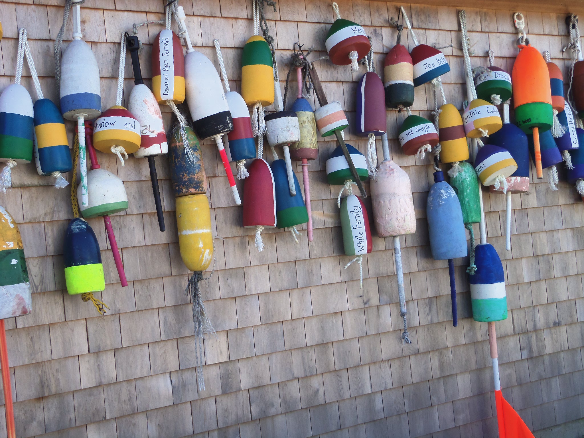 Each lobsterman has a set of distinctive buoys to identify his traps. This is how the floats look out of the water. Shingle siding adds to the effect.
Jaya, in Promise, isn’t the only character in my fiction to address a concept I’ve dubbed the DLQ, or Dedicated Laborious Quest. But she does, I’ll argue, come closest to aspiring to an artistic expression for its encounters.
The DLQ, as I envision it, is the long-range discipline of spiritual pursuit, one that can be found in any number of variations in any number of religious, artistic, social activist, or even athletic lines of action. It’s a blending of heart and head, body and soul, awareness and discovery – the poet Gary Snyder refers to something similar as the Real Work, for instance, or maybe simply “daily practice” will touch on it as well.
One of Jaya’s concerns is a search for a fitting vehicle to embody the experience. Essays are too prosaic. Poetry? Sometimes. Drawings or paintings? To a degree. Maps of a kind? Getting closer, I’d hope.
Even so, I’ve wanted to leave the ultimate form she uses open to the imagination.
And then, more recently, I came across something that comes closest. An exhibition of Shaker art and artifacts at the Farnsworth Museum in Rockport, Maine, introduced me to what are called Gift Songs or Gift Drawings or Gift Paintings, which take their name from the faithful artist’s position as a medium receiving the song or design from a deceased member of the sect (that is, given) to be conveyed to another, living member of the sect (also, as given). To be appreciated, these must be seen in the original, full size, since much of the detail gets lost in reproduction. Sometimes the words are in a secret, private language and alphabet. Sometimes they blend. The lines flow, turn upside down, sideways. The works are sprinkled with artwork as well as words. Are they magical? Or simply mysterious?
Whichever, they spring from a tradition and discipline and practice to utter something deep in the heavenly desire and earthly community of a particular recipient.
I can tell you Jaya would have been most impressed. Definitely.
 ~*~
~*~
To turn to my novel, click here.
When I moved to Baltimore, I was surprised to find all of the local pizza parlors were owned by Greeks. Not Italians?
Well, it took time before I discovered the alternatives, beginning in the city’s Little Italy.
But that occurred about the same time I was told most diners were owned by Greeks, too. And I’ve come to love diners, even though I’d been introduced to the real thing way back right after college. They just weren’t fashionable then.
Well, somewhere in-between there had been the Dairy Queen owned by a Greek-American who, though a big error by the Bank of France, wound up instantly nearly seven-figures rich – and took flight to his homeland before the error was discovered. It was a big news story where I was for the next month, before he repented and returned.
So more recently, I ordered a pizza from a local parlor. Wanted to support a young friend who works there. When I picked up the box, there was no gaudy image of a fat smiling chef on the top of the steaming box – a good sign, in my book. And then I noticed the design was mostly white with blue trim, adhering to the national Greek colors. Along with a border of … the signature Greek key pattern. OK, I thought. I get it. Even before I noticed the words gyros and pizza in a little house, side by side.
That does it. I’m definitely going back for a gyro.
And, for the record, the box is distributed from our favorite Italian grocery in Portland, Maine. Has me wondering about the rest of the story.
