Maybe you remember your first year or two after college and trying to get your feet on the ground.
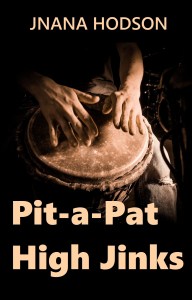
My wild novel Pit-a-Pat High Jinks relates, more or less, how it went for me way back when. It wasn’t always high, either, despite the stereotypes. These days, I see the episodes extending into the forties for many younger adults and their friends. Do check it out and see how it relates to your own experiences.
It’s of five ebooks I’m making available to you for FREE during Smashword’s annual end-of-the-year sale. You can pick yours out in the digital platform of your choice. Do note that it includes adult content, so you may have to adjust your filters when ordering.
Think of this as my Christmas present to you. In the meantime, be cool and stay warm.
After recently tweaking the cover for my Hometown News novel, I found my eyes zeroing in on another volume and once again questioning its effectiveness.
This design continues at Amazon. While Cassia goes Goth in the plot, I suspect this was a bit extreme for her style.
What’s Left: Within a daughter’s own Greek drama had been especially difficult to develop, as I’ve explained in earlier posts, but ultimately ended up following a girl who lost her father in an avalanche on the other side of the globe when she was only 11. She then continues on into her emotional recovery and growth, rounding out in her mid-30s.
By the time the book appeared in both digital and print-on-demand options at Amazon, the cover image had settled on a photo of a Goth girl.
For technical reasons, she continues at Amazon, while my cover at other digital retailers got updated.
I wanted a better sense of the initial suffering, or even an edginess in her development, but nothing worked perfectly. I am still taken with the daring in her stare at the camera, but is that enough? (I did a post about the earlier covers on December 20, 2019, should you want to explore my archives. I was quite fond of the first cover, the one with its falling egg yoke, but nobody else seemed to get the connection.)
The figure appears more ambiguous in my attempt to do something more in line with some of the Young Adult covers I saw. Ultimately, this was a mistake.
Furthermore, she’s genetically a mix of Greek and American Midwest and a tad on the pudgy side. I hate it when a story follows, say, a brunette but the cover shows an obviously dyed blonde.
Another challenge involved balancing the two words of the title. The second word, “Left,” should have the emphasis, but it’s only half the size of “What’s.” Nothing I tried corrected that. In many of the typefaces I sampled, “Left” simply didn’t read easily, either. It could have been “Lest” or “Lett” on first reading. In making a sales pitch, there’s no time for deciphering the message. “What’s” presented similar challenges in other typefaces.
The text had been difficult enough to nail down in a convincing voice, but the cover was equally problematic – especially finding an appropriate image. How do you summarize all this in a single graphic impression, especially one that works thumbnail size online?
Do note, there’s an ongoing argument about using a facial image on a cover, period. Does it grip a potential reader or does it turn one away? Will it even limit a reader’s impressions of the character at the heart of the book?
At last I had a photo that more or less captures her despair. The title and author presentation never quite matched.
Remember, my budget wasn’t generous enough for a graphic designer, the kind who would create a flowing dust jacket replete with insider clues for a potential reader. I’m not particularly fond of those designs anyway. In general, I think photos pack more punch in a first impression. Just look at magazines at a newsstand. Remember those?
Cassia, or more formally Acacia, goes into mourning after her father’s death and then morphs into Goth dress and appearance through her teenage years, where much of the story develops.
The book doesn’t fall neatly into genres – part of it could be Young Adult, but I’d say the core of it is New Adult and beyond. So how old should she look on the cover?
Finally, in the latest stab at this problem, I decided to run with an image I’d settled on earlier. This time, it would bleed off the cover at both sides for maximum impact. I then decided to run it off the bottom, too. Somehow, that left the photo square, a format her photographer father pursued.
At last, we have this.
My reason for cropping the photo tighter was to give it more depth, putting the focus more fully on the girl and her emotion. I’m now seeing that the rocky background I eliminated had actually suggested another kind of story. No more of that distraction now. An artist might have replace it with her extended family, by the way.
In leaving the top open for author and title, rather than separating those elements with the photo in the middle, she has more presence and gravity.
I’m also glad I stuck with an impulsive decision to not fill in the remaining cover with a background color. A new typeface for me, Yu Gothic Semibold, seemed to work best for the title, though I’m not exactly happy with the single-stroke bar apostrophe. But “Left” carries its own weight in the dance of letters.
Book Antiqua, meanwhile, a fallback for me, does nicely in italic for the author.
That’s all – clean, simple, and somehow daring in its starkness. Without an obvious border, the design declares its independence from paperbook constrictions. It’s also quite contemporary, in a confident way. It even pops out on websites. And there’s no question that it comes together more harmoniously the one it replaces.
This one’s now available on your choice of ebook platforms at Smashwords.com and its affiliated digital retailers. Those outlets include the Apple Store, Barnes & Noble’s Nook, Scribd, and Sony’s Kobo. You may also request the ebook from your local public library.
My novel What’s Left, was in no rush for completion, contrary to my own desires. Still, I wasn’t going to artificially pressure this one.
As for my personal surprises this time? Some of my favorite lines popped up while swimming my daily laps in the city’s indoor pool.
Here’s one of Cassia’s outbursts that almost prompted me to change the name of the novel itself:
Oh, my, am I torn! I’ll tell you this, though. Buddhism comes in very handy when other kids are giving you so much grief you threaten to cast a spell on them and break out chanting Su To Ka Yo Me Bha Wa repeatedly and then just watch them back away. Oh, I tell you, it’s so satisfying!
What’s that do?
You’ll find out. You better be good to toads.
You get lots of respect for doing that.
~*~
Which title Do you think’s better — “What’s Left” or “You Better Be Good to Toads”? Or have I overlooked something even better?
~*~
Think of it as a cool Christmas present for somebody really special. Available at the Apple Store, Barnes & Noble’s Nook, Scribd, Smashwords, Sony’s Kobo, and other fine ebook distributors and at Amazon in both Kindle and paperback.
Much of my literary writing has attempted to capture the unique sense of particular landscapes, sometimes to the extent that the locale becomes a character of its own. Serious wine drinkers might see this as a matter of terroir, meaning distinctive local flavor.
In my novel What’s Left, I tried to avoid this touchstone but wound up developing the neighborhood around the family restaurant anyway.
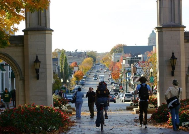
In placing it in a college town in southern Indiana, I created an inside joke all the same. If you’re familiar with the region, you’ll know the Ohio River is much more than an hour from Indianapolis. The college town where she lives is defined by both, and thus in a site uniquely its own. If only it actually existed!
Still, I think the flavor is right.
~*~
I know I’m not alone here.
Tell me of a favorite book or movie where you think the location becomes a character in its own right. Let’s make this a long list!
~*~
There’s nothing quite like an American diner in Paris …
For a writer, nothing is more magical than when a character begins dictating the story. Sometimes, you can’t type fast enough to keep up with her.
As I was saying about the “zipper” that sometimes appears while revising a work? This one, I’d say, is the most satisfying.
~*~
Now that I’ve confessed, it’s your turn.
Do you ever hear “voices” while doing something? Do they help or hinder your action?
~*~
My novel’s available at the Apple Store, Barnes & Noble’s Nook, Scribd, Smashwords, Sony’s Kobo, and other fine ebook distributors and at Amazon in both Kindle and paperback.
As a reader, you probably don’t pay much attention to the bones of a book — the number of chapters it has or how many sections they fall into. For a writer, of course, these can be central considerations. Ideally, there’s a beginning, middle, and end for each chapter and each section as well as the entire book itself.
In my psyche, one ideal structure is the symphony — typically, but not always, four movements, each one different, having an underlying unity that ends in an exciting climax. (Oh, there are some gems that do end quietly — so much for expectations!) A typical novel, on the other hand, may be twenty to thirty chapters of roughly 20 pages apiece running in chronological order, not that I’ve ever stuck with that convention.
In What’s Left, my novel I set out hoping you could start or end in any chapter, yet in some way they’d join to build the tension and resolution of the whole. The model that inspired me appeared to use chapters as mosaics or panels that could be moved around independently, if the reader desired.
I can’t quite see doing that in the final version my work, though a reader might leap over a chapter or two, if needed, and still pick up on some action — if, that is, the chapters are complete enough in their own right. Think of a string of short stories.
~*~
If you’ve had a chance to read What’s Left, give me your feedback.
Does this structure work for you? Would you rather I’d broken the novel out into two, three, or four shorter books as a series? Did you skip over any parts? Would rearranging any parts work better?
~*~
In my novel, the family’s upgraded Carmichael’s restaurant could have emerged like this one in London. Instead, they took a bolder direction, even if a Greek menu wasn’t a viable option where they were.
Let me repeat, What’s Left is my final novel, even though it’s appeared before several earlier ones — or their later revisions. That doesn’t mean I might not rework some more of my earlier books, but I have no intention (at this point, ahem) of undertaking such an ambitious project.
Still, if it’s ever successful, there can be a demand for a sequel. There are many possibilities that point to further development.
One plot twist I considered was this:
A handful of the Erinyes’ grandchildren rebel by returning to attend college across the street from Carmichael’s. Perhaps it’s inevitable that they apply for jobs in the restaurant.
Can they work? We’ll let them decide about becoming cousins.
This could have opened considerations about rebalancing the ownership, for one thing. Or more dimensions to our understanding of what it means to be a family. Or even their own reasons that parallel those of Cassia’s father in moving way back in the early ’70s.
~*~
It’s a big book, admittedly. But it could be a lot bigger.
Where would you take the story of What’s Left from what’s already there? What would you like to have answered?
~*~
I wonder where Cassia’s generation of her extended family or even their children go from here as they face today’s big challenges.
It’s is not my debut novel. Rather, I have the feeling it’s the opposite — the final one. I could never do this again. What’s Left is a big novel chock full of surprising turns, deep thoughts, and lively details. Unless Cassia starts speaking to me again, there will be no sequels. For me, at least, the story condenses so much into its pages I’m feeling completed.
Unlike my earlier novels, this one was not written on the fly while working full-time as a journalist. Like them, though, it’s undergone extensive revision.
Woven through the book are themes I’d explored in my earlier stories, now seen in a new light, while investigating others I’m tackling for the first time. Family and family enterprise, adolescence and childhood, death and divorce, and Greek-American culture, especially, are new while counterculture, romance, spirituality, community, nature and specific place, livelihood, journalism itself all run through my previous work.
~*~
Think of this bit as going into the compost rather than being served on the plate:
All I’m doing is asking you to apply your new comprehension to the rest of your life.
~*~
Of course, you’ve heard somebody blurt out, “I’m never going to forget this as long as I live!” Or some such. And sometimes it’s true.
Me? I have trouble remembering nearly everything. Could it be one reason I read so widely is to help me remember? Of course, writing gets it down on paper, once again so I don’t forget.
So while I read to help me remember and to gain insight on the world around me, it’s not the only reason by any stretch.
What do you look for most in a novel or poem?
~*~
A large Queen Anne-style house with a distinctive witch’s hat tower something like this is the headquarters for Cassia’s extended family in my novel. If only this one were pink, like hers.
In creating What’s Left, I’ve been on fragile ground with both Greek-American life and the behind-the-scenes realities of the family restaurant business.
Those are both places your insights would be gratefully received, especially when I hit a wrong note.
Well, we can extend that to the entire work as it treks across a lot of unfamiliar ground.
What have I caught right? And where I’m I off-track?
~*~
Horiatiki. I’ll probably leave some ingredient out when I make it. Or add something I shouldn’t.
These days some of my favorite daily encounters come at our city’s indoor pool, where I swim laps. In addition to the familiar faces of fellow swimmers, there are the interactions with the lifeguards, many of them still in high school. When they’re not actively watching us in the water, they have rounds manning the front desk, where they might also be doing their physics homework or working on a paper. In other words, they were the right age to help me with my novel What’s Left, not that I’m ever that direct. No, just a wild question or subtle ear’s enough to keep me grounded in their direction.
In revising a manuscript, I sometimes chance upon a “zipper” that seems to run along the entire piece and releases something trapped within it. Tugging along page after page is an amazing experience, when it happens, which is not nearly as often as I’d hope. Mercifully, that’s what’s happened in the ninth revision of What’s Left, my novel thanks to comments from some of the early readers. The key this round came in having her talking to her father throughout, at least in her head and often in the midst of other people, rather than simply about him. It gives the work a whole new dimension and makes the story far more intimate, especially when she makes irrational leaps that match her emotions.
This, in turn, allowed her to relate much of her investigation as it happened as a young teen, rather than looking back on it from her early twenties, and had her aunt Nita and her best friend, cousin Sandra, present as co-conspirators.
Note that none of these revisions changed the way I saw the novel as an author — I knew how it begins, develops, and ends — but they change it entirely for the reader.
Yes, the changes were extensive. When one of the lifeguards remarked, “What? You’re not done yet?” I came back the next week with two pages from the hardcopy I was working from — half of the sentences containing crossed-out words and phrases, several moved to new locations, and a taped-on flap of new notes to add in, all needing to be keyboarded. It’s typical professional work, as you’ll discover reading the Paris Review or any number of writer-oriented magazines.
Still, they were astonished. I doubt they’ll look at a 500-word assignment quite the same again.
The point is that all of these changes are for the reader. Curiously, the very shift of having Cassia speak directly to her father throughout soon has the reader stepping into his shoes, hearing through his ears in a new intimacy.
And now I trust the story’s ready for you, as its reader.
~*~
It’s not always simply a coincidence, is it?
Have you ever started out on your way to one place and wound up somewhere quite different? Somewhere that turned out to be right? Tell us about what happened.
~*~
Working with photographic film, as Cassia learns to do with her father’s archives, means learning to “read” negatives like this one by Yuukikatrarra. She’s good.