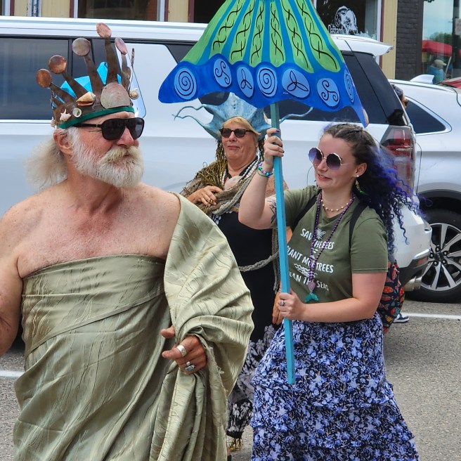
Drew Proctor fits the role divinely for the annual Mermaid weekend ArtsWalk festivities.
You never know what we'll churn up in cleaning a stall
Drew Proctor fits the role divinely for the annual Mermaid weekend ArtsWalk festivities.
Although my classmates in a contemporary novel course rhapsodized over One Flew Over the Cuckoo’s Nest and the author’s later role as a Merry Prankster advocating LSD use, I was fonder of Sometimes a Great Nation, which I read while living not all that far from its setting in the coastal mountains of Oregon. Sections from the unfinished Seven Prayers of Grandma Whittier were also tantalizing. Now I am wondering about his naming of the grandmother, as a nod to … Quaker?
Kesey is fascinating as a forceful, larger-than-life counterculture celebrity, even notoriety, from the Beat movement on. How could anyone begin to compress his activities into prose, either fiction or nonfiction?
Both of his novels were published by the time he was 30. Maybe he was just too busy living to continue.
fog
clouds
ICE
WATER
We’ve already met a ferry. Most of Isle au Haut has national park status as part of Acadia. The boat takes foot-travel passengers, too.
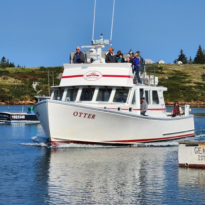
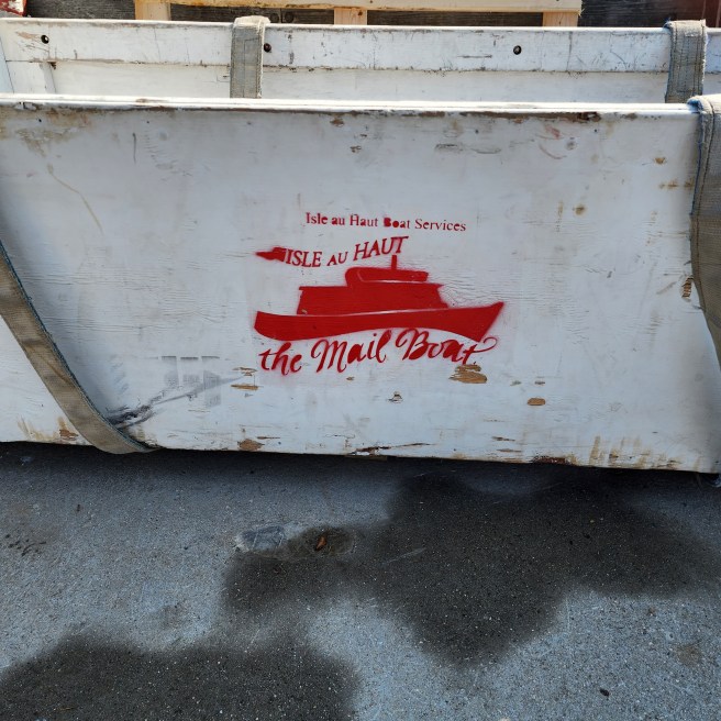

A scene along the way.
Eastport is preparing to welcome eight cruise ships for visits after Labor Day. That’s about half as many as last year’s record but could top it in the number of passengers. Four others were slated to visit but had to change plans when Customs could not provide agents to clear passengers and crews into the United States.
So far, I’ve found seven of the expected ships.
The visits have boosted the local retail season for many merchants, especially after the Summer People have retreated to their usual haunts.
Removing the old asphalt roofing and underlying sheathing and replacing them with standing-seam metal roofing promised to be an encore act of last fall’s drive on the back half of the house. A dustpan, or shed, dormer, connecting what had been two small dormers would be the biggest design difference.
This time the work would be in full view on a central pedestrian-friendly thoroughfare. By now, the renovation is a widespread topic of conversation, year-round residents and summer people alike. Yes, one more aspect of small-town living.
Once again, new rafters would replace the old ones, many of them charred in the 1886 downtown fire as well as a later chimney fire or two. And the new 2-by-12s would be more numerous than the old 3-by-4, 4-by-5, and 5-by-6 beams they were replacing. They would also be up to building code rather than sporadically placed. Better yet, they would be solidly joined to a ridge pole and the four central structural support columns our contractor had inserted last fall. Earlier episodes of this series discuss the intricate work of getting those significant details into place.
Once underway, this phase turned into something more than a quick encore. Removing the two dormers had its own complications, and then a series of rainy day forecasts prompted Adam to concentrate on the south end first rather than the full roof in one sweep.
Further complications came in finding the sheathing was doubled, unlike the back, and a desire to salvage as much of the timber as possible. Some folks in this project are hoping to make a dining room table or some such to recognize the home’s heritage.

Our thinking about this project has definitely changed. Adam is really rebuilding the top half of our house, not merely remodeling it. We’re most impressed. Technically, it’s still post-and-beam aka timber framed.
Would I have gone along with all this if I had known about all this at the outset?
We really didn’t have much choice. As we’ve been discovering, there was so much trouble just waiting to happen. Fortuitously, we’re addressing it all proactively rather than in a panic after an overhead disaster.
We’re no longer tempting fate, are we?

Cony Park, Eastport, Maine
With my training as an artist, I have some strong feelings about book covers. Most of the ones I see leave me cold. I think they’re too cluttered, and most of them lack a strong graphic element – I prefer a good photograph though am coming around on the painted image argument – and I like a clean, easy to read impression. Some of the typefaces used for the title or the author are nearly impossible to make out.
I did have a friend who was a professional illustrator for a Fortune 500 corporation. CAD (computer assisted design) was overtaking the field, and he felt it was destroying his artist’s hand, the one with the Rhode Island School of Design sharpened skills. His aspiration was to design old-fashioned book jackets, and while his style there wasn’t my cup of tea, I could see its appeal. Fortunately, he conceived a children’s book that took off, in part because it was based on a Pete Seeger song, which did get buyers’ attention. And led to many more all on his own.
I still don’t understand all the nuance, though. Is it true that a certain strand of fantasy is supposed to have a specific element woven into the cover to alert a potential reader that this is the subgenre she’s looking for? You know, maybe a touch of moonlight or a small bat in flight or a golden glimmer in someone’s eye?
I am learning, though. A cover makes a promise with a reader, so I’ve heard at Smashwords.
My thoughts on cover design and some of my favorites appear in earlier posts here at the Red Barn.
Self-publishing requires much more than merely producing a compelling text.
Naming a book is hard enough. For the record, I found naming What’s Left to be my most difficult, as I’ll explain in a future post.
In the world of books, and not just ebooks, a strong cover is crucial.
If you can afford to hire an illustrator or graphic artist to design yours great. I’m envious.
My first novel, in paper, wound up with an “art designer” misfire. Rather than respecting the black-and-white photo of passengers in a subway car, a flat yellow lotus shape was cut into the image with the title and author credits inside that field. It didn’t fly. In addition, my name wasn’t left as simply Jnana, as I desired. It was the full yoga version, an additional five syllables or 14 letters. Well, it kinda has a 1950s feel, even with some graffiti on its walls, but the action was all high hippie ‘60s and early ‘70s. I’m now wondering if getting a tagger to do the cover would have been a more successful alternative. I’m sensing it would have been a more in-your-face result. Buy me now!
For my first round at Smashwords, I hired a book designer who was, I seem to recall, living in the Czech Republic. Emailing made everything easier, including paying him via PayPal, which was new to me. Since he had a deal with a stock agency for low-cost photos, I rifled through its online pages filled with shots that might fit my need.
It’s harder than you’d think.
A good cover isn’t a poster. It’s more like a billboard on a much smaller scale. And your potential readers are zipping by.
The right photo turns out to be a rarity. It has to somehow reflect the story and still attract a buyer.
Even when you find a good fit, there can be problems. For instance, the photo I settled on for Hippie Drum was a black-and-white portrait of a shirtless young male playing a set of Conga drums. It even looked a lot like me at the time of the story. Little did I know how many viewers it repulsed.
There is debate over showing a person’s face on the cover. It can limit a reader’s perception of your central character, for one thing, and one reader’s ideal can be an instant rejection from another.
If you’re going the human face route, you may find the perfect photo with one slight flaw. She’s a redhead while your character’s brunette. It may be easier to tweak the book to fit the cover.
The experience of tweaking a character to fit the cover image.
There’s also a debate over a painted or drawn artwork versus a photograph.
When I got around to designing my own covers, I came upon a drawn image of a single daffodil bloom. How perfect and I still love it. And within the title I inserted a peace emblem for an “O” in DAFFODIL SUNRISE.
A few years later, when I changed the title, that cover went out of circulation. That peace emblem just didn’t work with the new version’s Kindle print-on-demand cover, either.
I have to admit a special fondness to the ones on Subway Visions, Yoga Bootcamp, and the Secret Side of Jaya – none of them photos.
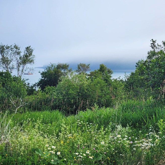
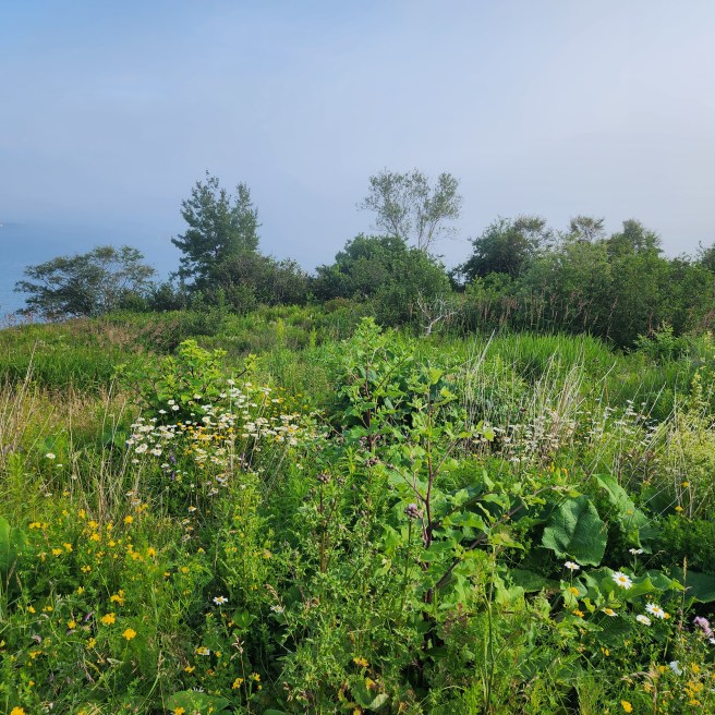
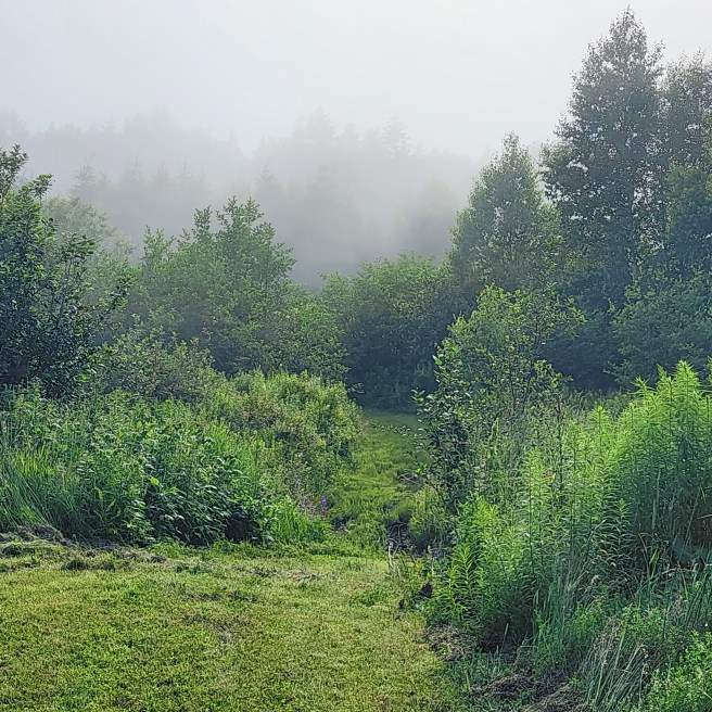
Late afternoon, Cony Park, Eastport, Maine, as the fog rolls in.
It will be no alleviation that these powers will be exercised by a plurality of hands, and not by a single one, 173 despots would surely be as oppressive as one. Let those who doubt it turn their eyes on the republic of Venice.
James Madison in Federalist No. 48
 Jnana's Red Barn