FROZEN COD SPECIAL
You never know what we'll churn up in cleaning a stall
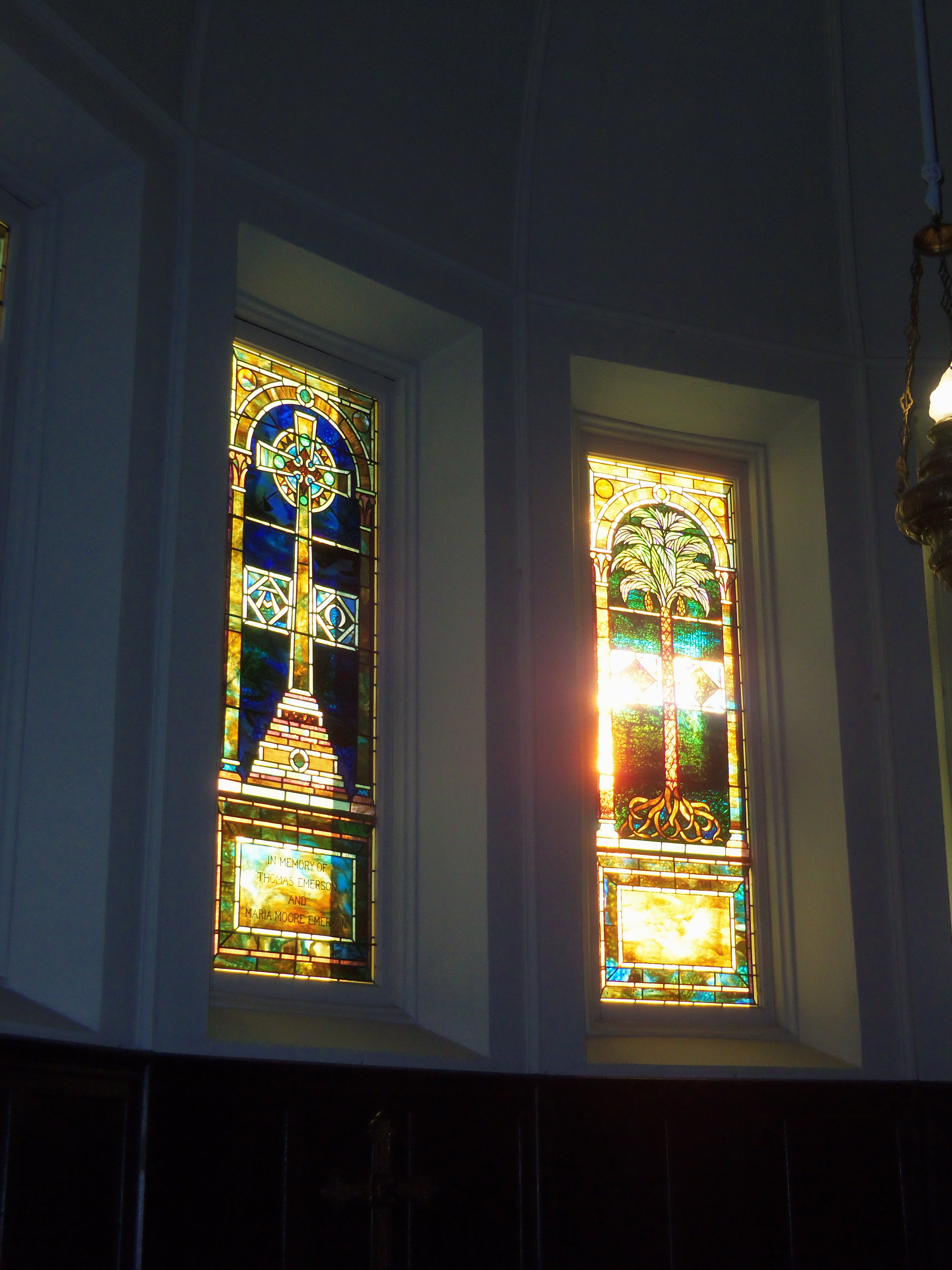
From the pews in the sanctuary, the five stained-glass windows over the altar appear curiously bland in contrast to the two vast arrays to the left or the rear. Only if you cross into the chancel and catch a glint of sunlight might you sense something quite different is at hand before you.
That’s how I first noticed that unlike traditional stained glass, none of this set had been enhanced by paint. All of the color was in the glass itself, yet there were no muddy patches where colors overlapped, as might be expected while mixing pigments. Some of these resembled Impressionist painting or bookmaker marbling. Moreover, when direct sunlight hit some of the pieces, the color blazed with gold or copper or fine jewels.
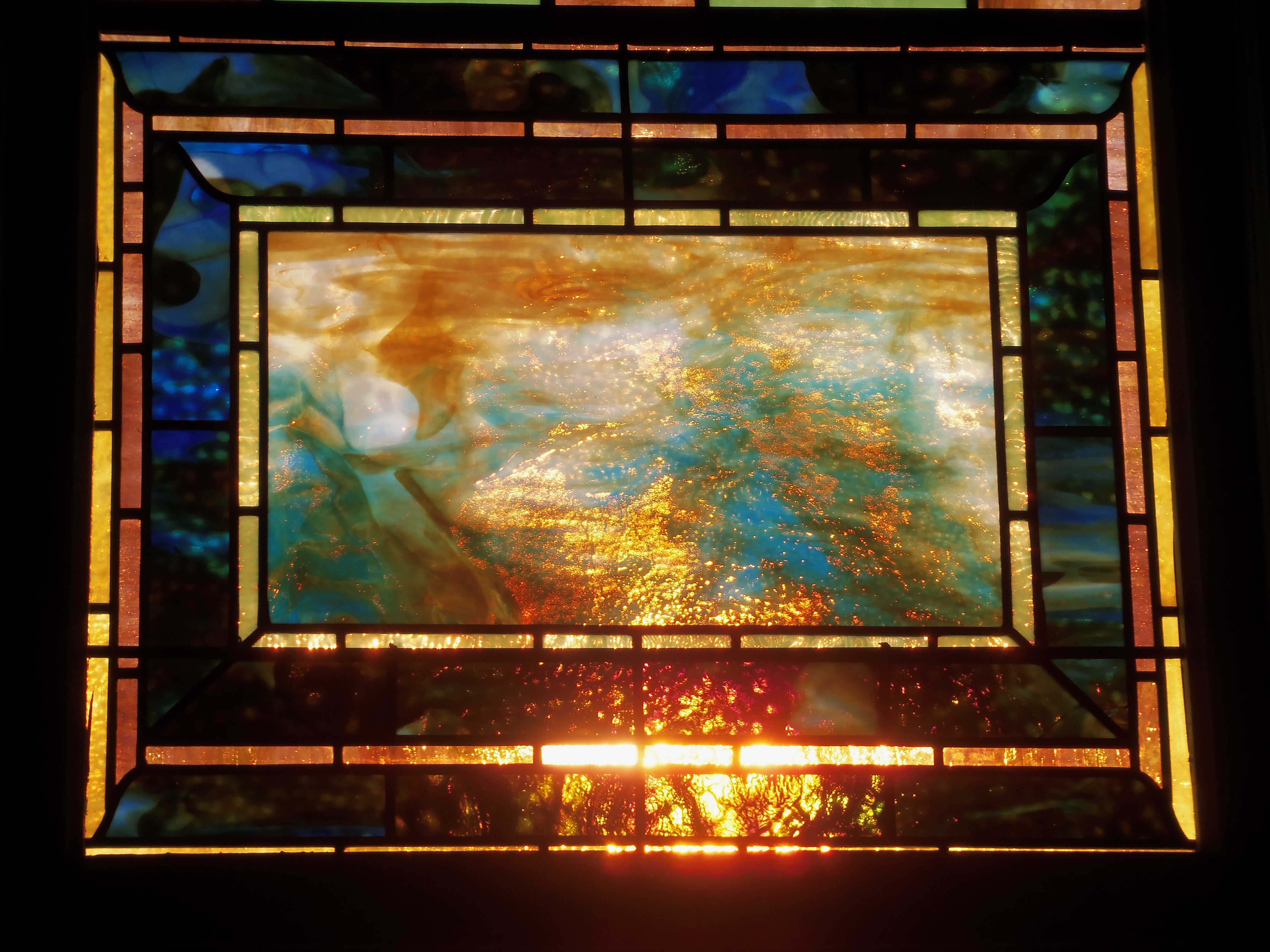
Could it be? I’d heard that one reason Louis Comfort Tiffany obtained such incredible effects in his work was that he used such materials in his glass. For starters, the only way to get a gold color is to use gold.
As I started to seek documentation, some fascinating connections appear.
As it turns out, the Tiffany Glass Company and its successor, Tiffany Glass and Decorating Company, created thousands of ecclesiastical church windows. Many of these were designed and executed by his studio, rather than Tiffany himself, but they would nonetheless bear his stamp and influence.
Tiffany’s 1890 Hay Memorial at Emmanuel Episcopal in Pittsburgh presents some striking similarity to the set at the 1895 St. John’s Methodist in Watertown, Massachusetts.


Both are narrow arched windows with greenish bottom panels ringed in copper tones. The central cross resembles the crosses at Watertown. And the mention of Tiffany’s love of exotic Oriental painting and his travels in northern Africa might explain the two Watertown windows dominated by palm trees.
The Watertown congregation originated in 1836 in the Whitney family home, and they remained active supporters at the time the 1895 stone building was erected. Their David Whitney Jr. relocated to Detroit as a young man, quickly became that city’s wealthiest resident, and built an 1894 mansion that still features its elaborate Tiffany windows.
Finally, I run into the pastor as he’s leaving his office. I pose the question, “Tiffany?”
“Technically, no.”
“His studio, then?”
“Yes.”
Regardless of the creator’s name, these five windows are marvelous, especially when struck by sunlight. Unfortunately, their placement on the west side of the building means the Sunday morning worshipers would not get to view them at their best.
Vespers, anyone?

I’ve long joked that our Quaker meetinghouse has the prettiest stained-glass windows in town. That’s because they’re clear, looking out to the hardwood trees surrounding the grounds and all of the seasonal changes. The colors are those of snow and ice, spring greening, fog, mist, rainfall, autumn foliage. Admittedly, the new synagogue, with its view over a hillside to forest beyond, and the Methodists, at the edge of a millpond, can make rival cases. I’ll plead to being partial.
Crucially, though, transparent windows remind us of the world beyond the house where we sit in worship, a reflection of our awareness that our faith is a constant part of our various daily life activities. They remind us as well of the powerful rhythms of nature and God’s creation.
On the other hand, most congregations – including the Evangelical United Brethren of my childhood – gather within rooms of filtered light cast by stained-glass designs. I was puzzled by it then, and remain so today. Yes, I know the colored windows of the great medieval cathedrals were illustrated storybooks for the illiterate populace, but what I encountered always felt second-rate and often mildewed. Few individuals, I suspect, could say much of anything about the event being depicted or express any understanding of the decorative filling. Pointedly, the translucent windows cut off any view beyond the room. Perhaps the intention is to create a holy space – one set apart from normal life; perhaps, too, this hints at eternity as a departure from the landscape we know. But a shady or even creepy quality always seemed to lurk in the shadows. This is, I will note, quite different from the icon-based frescoes of Eastern Orthodox custom.
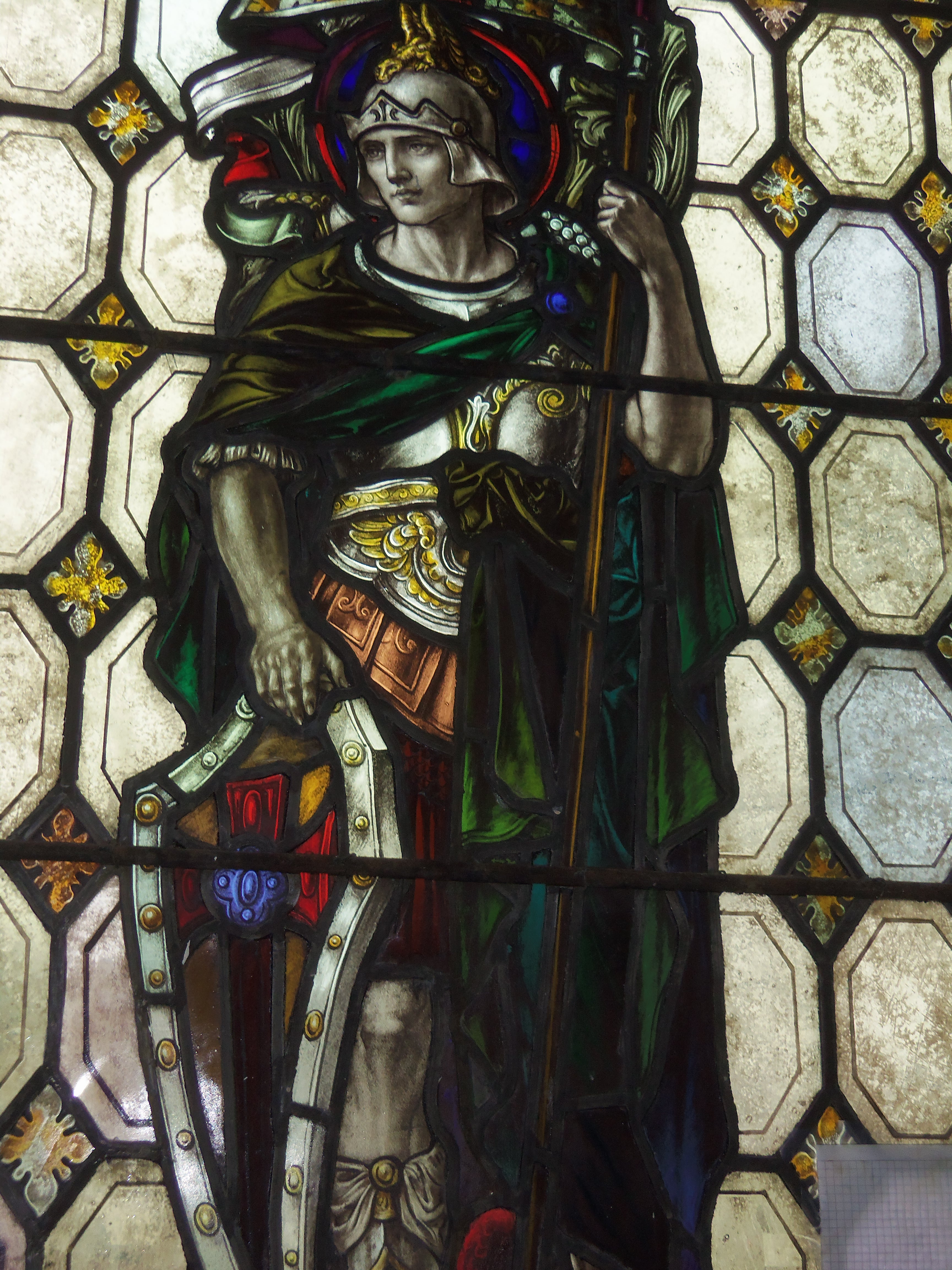
Apart from a few December afternoons at the National Cathedral in Washington, when I finally experienced the dazzling sunlight through the windows and recognized how Rose windows earned their esteem, my encounters with stained glass were few and fleeting. That is, until late one afternoon last year when I arrived early for our weekly chorus session and stepped from the room where we rehearse, crossing into the sanctuary on the other side of the sliding shutters. The square vaulted room is dominated by two imposing displays in traditional style – painting, essentially on pieces of colored glass that are then leaded together. Something about these, though, suggests quality sustained by wealthy donors. The impressive room has demanded closer investigation.
If the late 19th century brought about a flowering of stained glass in America, it was also a time before the spread of public art museums. Windows like these, then, would have been art made available to all for their wonderment.



When it comes to art museums, I head straight for the paintings. The other displays, including art glass, come later.
Actually, glassworks as art rather than craft came to my attention largely through the glass-blowing compatriots of my now ex-wife (we’d save clear bottles for her circle to melt down and reform as fine-art creations) and her grandmother, a knowledgeable antiques dealer who specialized in glass collecting, which was quite appropriate considering our location in a former glassmaking mecca that included Toledo, Tiffin, and Fostoria, Ohio. (At the end of the 19th century, an oil boom meant plenty of cheap natural gas, allowing affordable conversion of sand into glass.)
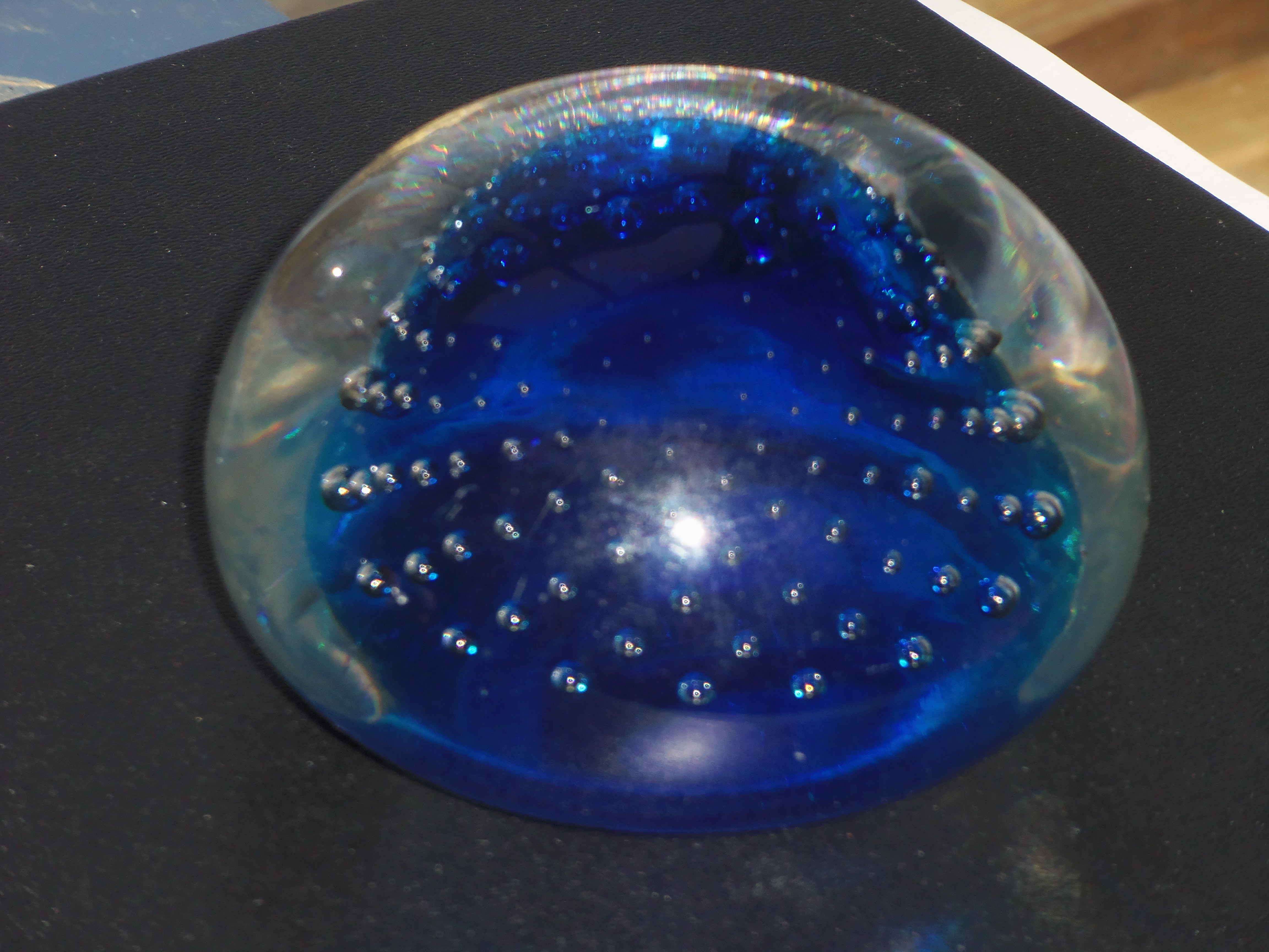
These days the Henry Melville Fuller Paperweight Collection at the Currier Art Museum in Manchester has expanding my regard for glass artifacts, even if I do head first to the paintings.


Shifting to the world of epublishing has stimulated a gentle learning curve for me. Maybe because my to-do list has always been much longer than I can manage or maybe because I felt I already had too much detailed work at hand, I’ve tried to avoid becoming a computer geek who spends all his time in the technical minutia. Actually, it’s the same way with my cars – I don’t want to spend my mornings, afternoons, or weekends under the hood or on my back under the chassis; I just want to get in and drive. As for high tech, I’ll wait for all the bugs to get worked out before I buy the updated version, thank you, especially since I’ve always been on a very limited budget. And for the record, I hate Windows 8, which is always interrupting my work by blowing its apps in my face or requiring me to log on again throughout the day.
On the other hand, keyboarding on a computer has been a vast improvement over a typewriter, at least for klutzes like me, and the ability to correct and revise as I go or rewrite and edit later is, well, divine. Sometimes progress really is progress.
And sometimes it isn’t, as we seemed to discover at the office each time we moved on to a new system whether we wanted to or were instead forced to when our current equipment was declared obsolete. (I’ll let others relate those nights of terror when they pulled the plug on what was finally working as promised.)
Participating in the small-press literary scene has been another matter. When I first ventured into email, thanks largely to my now-wife, well, let’s say broadband’s been a huge improvement over those telephone connections and leave it at that. Still, cutting and pasting poems into the email and having them accepted within hours rather than be rejected months later was quite an eye-opener. These days, with most of the liveliest literary action happening in online journals, the process has taken leaps forward; typically, you use a submissions program, upload your file, insert your cover letter, and follow the pieces through the editorial process, if you wish. For a long time, I tried to maintain two sets of files – one for journals that still used, or even required, submissions via the Postal Service, and those that took them online. This year, finding that too complicated, I decided to drop the postal-only journals altogether. (That move, let me add, was hastened by problems with our computer printer as much as the much higher rejection rate on the envelope entries.)
The 2005 publication of my second novel, Ashram, as an ebook was another eye-opener. I was surprised by how easy its preparation was, how quickly it went from acceptance to general availability, and how pleasurable reading a long work on my computer screen could be (even if the work was issued only in PDF format). Unfortunately, we were also a bit ahead of the ebook reading trend and many would-be readers told me of their difficulties in downloading the volume. The other snag was getting the work reviewed at all – even online critics stuck solely to paper editions.
Blogging has revolutionized much of this world, probably more than we realize. For me, avowed neo-Luddite that I am, WordPress has been heavenly. It’s allowed me to take a model “out of the box” and run with it without modification, even if I do admire the customized tweaks many of the rest of you add apparently without hassle. The Blogs That I Follow, searching by topical tags, and Freshly Pressed streams have introduced me to many wonderful voices around the globe for my daily perusal. In fact, I’m still struck that in its first year, the Red Barn had readers in 72 countries. Amazing.
These days I’m learning again. The opportunity to publish my novels to be distributed across a variety of platforms (as they say) has meant following a new set of directions to strip out all the hidden codes (we hope; some of mine go back to the first versions on WordPerfect4.0) and set up the work to flow smoothly in a reading device. (I started to say “reader,” but for me, that will always be a person, not a machine.) I’ll admit that adjusting to the concept of considering a long work as a continuous text, rather than pages, has been major, as has the matter of inserting hyperlinks. Remember, I’m someone who loves the art of printing from its very origins. (How many Gutenberg Bibles have you seen?)
Even so, I’m excited by the new opportunities and the new visual dimensions.
Here we go, again.
We could be considering writing or painting and drawing as much as the photography that prompts today’s line of thinking. Specifically, I’m reflecting on the tension between trying to capture everything I see everywhere versus the reality that one needs limits.
For starters, I reach a point in shooting where I begin to weary. Push hard enough and everyone hits a wall. When it comes to photography, I just stop seeing images of interest. When I’m writing, my words go flat. Folks in other endeavors can relate their own versions.
A second fact of life comes in trying to arrange and manage what I already have. Accumulate too much and I’ll never find anything when I want or need it.
I find a similar tension in a writing project, where I can hope for a tightly focused, crystalline work even as it begins to expand into a complex baroque construction. Or the other way around.
As I’ve been shooting over the course of the Red Barn, I’ve found myself increasingly resisting an urge to range more widely from my base in Dover. I’m sticking more and more to what’s at hand here and in a few other familiar places like Sandwich, to the north, and Fort Foster in Kittery Point, Maine. We’ll see how that evolves in the future.
For now, what fascinates is seeing how much new keeps appearing to me in our yard or while I’m walking to meeting for worship on Sunday. Perhaps that’s why working on pieces in a series hold so much appeal as more and more keeps surfacing from the depths.
The other aspect of the series is the desire that somewhere in there is the one iconic piece that rises above the rest, can stand on its own, deserves its own place.
Oh, what would Monet say to all this? Or Matisse? Or any of a host of others!