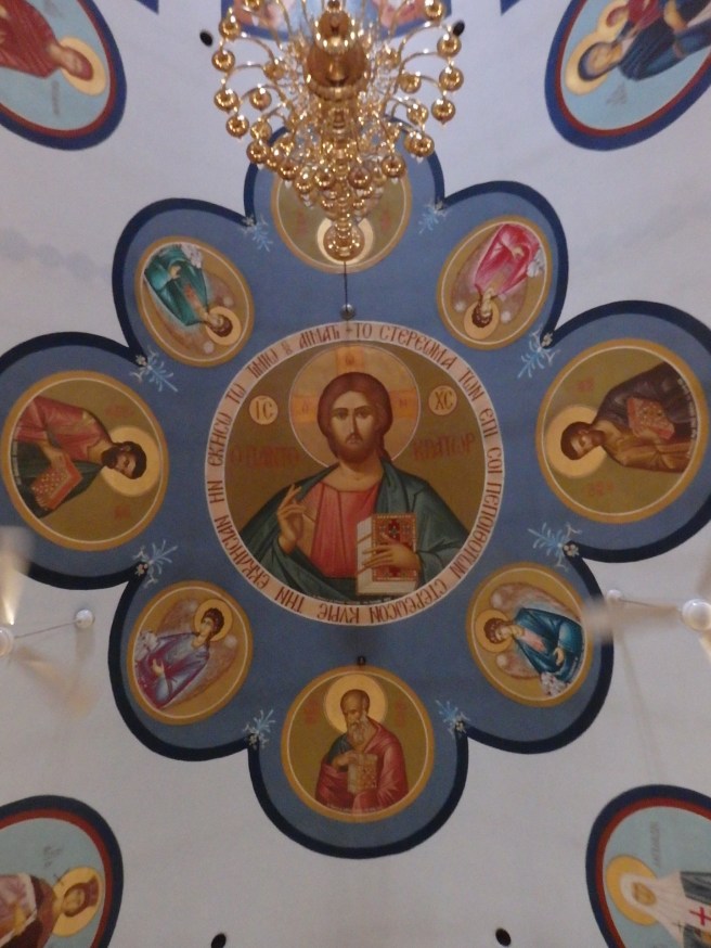
For the Eastern Orthodox, today ushers in 40 days of Pascha, or Easter. It’s not a one-day event, but the joyous response to Great Lent, culminating in the feasts of the Ascension and Pentecost.
You never know what we'll churn up in cleaning a stall
For the Eastern Orthodox, today ushers in 40 days of Pascha, or Easter. It’s not a one-day event, but the joyous response to Great Lent, culminating in the feasts of the Ascension and Pentecost.
The Swedish retailer of low-cost home furnishings, appliances, cookware, and the like is a magnet for folks trying to make the most of tight spaces like apartments. Say a challenge like a 400-square-foot apartment.
Even if you have an old five-bedroom home like ours, the interiors can be challenging. IKEA has frequently come to our rescue. Yes, some assembly is usually required, and I can attest it’s not always idiot proof, but overall, we’ve been pleased with the results.
The closest IKEA superstore to us is located south of Boston, and since deliveries aren’t cheap, it’s worth the four-hour round-trip, even if you get lost inside once you’re there, as I have. The cafeteria, by the way, is quite the bargain.
Are you one of those intrigued by the small-scale living space displays in the IKEA superstores?
What’s your experience been?

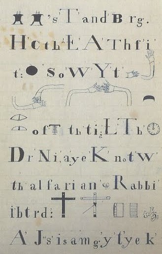
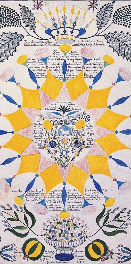
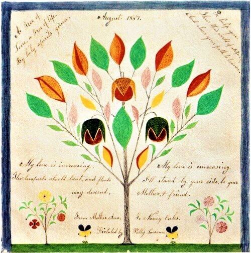
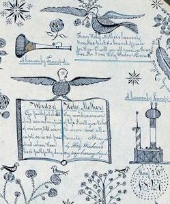
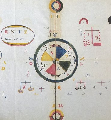
In my novel NEARLY CANAAN, Jaya searches in her spare time for an means of personal expression that isn’t quite poetry or prose but somehow truer to her spiritual stirrings. After I finished drafting the book, I came upon an exhibit of Shaker gift drawings and writings channeled by one member of the monastic community to be presented to another. Sometimes these would also originate as song, and an unique form of musical notation also arose.
Here are a few examples.
Book cover design, as we’ve previously discussed, is a tricky endeavor. The presentation has to be visually catchy but also reflect the contents of the book itself.
Ebooks, where my works are appearing, have their own additional challenges. Since these volumes are sold exclusively in online book retailers, their cover images are essentially thumbnails, unlike their print counterparts, which are meant to be displayed in stores or library shelves. Nor do these digital publications have spines, which are a unique design concern in itself – until recently, I hadn’t thought how crucial that narrow impression is in attracting my attention when I’m scanning a row of books for something to read. And ebooks don’t have back covers, where the words of praise appear and author’s portrait faces you. That’s a lot for an editor and artist to work with.
Creating a suitable cover for my novel What’s Left became maddening. The work weaves together a lot of themes and subjects, and hinting at them in a single visual image isn’t easy. Family, food and the restaurant they run, their Greek identity, the protagonist’s broken childhood all come into play. Every time I thought we had something functional, one of the in-house critics would raise a valid objection. I finally went with the egg yoke suspended in space as an attempt to convey a sense of being broken open emotionally as well as her own family’s long hours over the grill in their restaurant.
I still think it’s a striking cover, and I’m quite fond of it. But I’ve also been sensing it misses the mark. The focus in the story is on Cassia and the ways her grief as a child impacts her life’s direction. It’s the emotion, after all, that matters most.
I hope this new cover conveys that message.

For comparison, here’s the original cover:

What do you think?

As he said: “It has to be raw and sophisticated at the same time.”
He often revised by looking at models in a mirror … would see the flaw … like looking through a camera, framing?


