We’re at a point of downsizing. On a limited budget, at that.
Here’s what’s on my list of considerations.
~*~
A pleasing work area: In my case, that’s the writing studio. For my wife (the foodie), the kitchen and pantry plus utility space. And in both, abundant wiring.
A good view: In our dream, we’re looking at the ocean, but a lake or mountain might do.
Wood heat: At least as backup. We’ve been very happy with our efficient Jotul wood stove. Besides, it’s good backup during power outages.
Adequate insulation and heating/cooling: We’re set on New England, after all. Cold drafts are expensive and annoying. And summer is really only six weeks.
Easy maintenance: I’m not a hobby do-it-yourselfer, and I have other ways to spend my time than amateur house repair. Our budget needs to keep calls to construction-industry tradesmen minimal.
Smart use of space for our needs: Think affordable IKEA. Bigger is not necessarily better.
Sufficient and efficient storage: Closets are a recent addition to New England houses. Take it from there. In our case, this would also include expansive bookshelves and a large garden shed.
A three-season porch: Elbow-room, if you want, especially for entertaining guests in all but deep winter or tackling special projects.
Minimal snow plowing: Even a short driveway can be difficult to clear if there’s nowhere to pile the snow. A long driveway can be expensive to keep clear and, for that matter, decently paved. As for parking?
Hot tub? Well, this is a dream list and there is that three-season porch.
For whatever reasons, a writer’s workspace holds a fascination. Many readers envision a kind of magical chamber somewhere, and we writers often dream of the perfect setup, though Annie Dillard’s concrete block room with no outside distractions may be the better option. Mark Twain even had a billiard table in his, on the top floor, no less.
These days, mine’s under the slopping ceilings in the north end of our third floor. A single window, rattling in winter and letting bugs in through the edges of the screen through the summer, is the sole connection to the outside world, apart from rain or squirrels pounding on the roof above.
There are days, though, when I do wish it had dormers on each side, not just to open the headroom up, either, but to allow me to figure out what’s going on when I hear something. Did someone just pull up in the driveway, that sort of thing.
Not that I could justify the expense anytime soon.
What one touch would you like to add to your own living or work space?
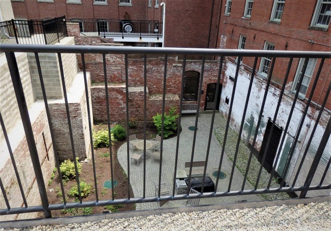
The transformation of the former newspaper plant downtown continues. What had been an essentially blank wall against the children’s museum and park is opening up to take advantage of its views that include the bend in the river.
The crown, common to the late 1800s buildings up the street, came as an unexpected but traditional touch.
I happen to love big windows with a corner view, as I imagine these have.
Back in April, Smashwords co-founder Jim Azevedo presented a six-hour writers conference via Zoom for ebook authors newbie and long-standing. I found it a rich experience and must applaud his stamina in sitting in front of his computer screen camera that long.
From this to …
His candid advice about rival Amazon prompted me to bite the bullet and look into reformatting my novels for Kindle Direct Publishing as one more digital retailing site for my work. I am, after all, fiercely loyal to Smashwords. Still, with Amazon, the most exciting thing is that I can now offer my work in print-on-demand paperback editions as well. I’ve come to love ebooks, but paper is, well, a special world to me.
Amazon has cleaned up many of its earlier formatting issues, and I can say my maiden foray went surprisingly smoothly. The one hiccup came with the paperback cover – my existing one was too small to run full-size. I compromised by reducing it within the glossy black background field.
I recently posted about tweaking that cover, which I did back before the online conference. Fortunately, it holds up to the new twist that’s been added to my thinking.
Azevedo spent some time covering the importance of covers, something I’ve previously blogged on. Frankly, from a design point of view, I find most book fronts to be cluttered and unfocused, combined with artwork that often strikes me as soft.
The making of a hippie
Maybe it’s all my years in journalism, but I’ve long leaned toward photographs as having more impact than paintings or drawings, and I want a strong graphic element other than type. Ebooks have an additional challenge of appearing, as Azevedo said, like postage stamps at the digital retail sites. That means any cover graphics have to pop if they’re going to catch your attention at all. You can’t be the least bit subtle.
What really struck me in Azevedo’s pitch was his insistence that a good book cover makes a promise.
What? The cover doesn’t mirror the story?
No, a promise.
As I started pondering potential new fronts for my paperback releases, his point kept kicking in. The result is a slew of new ebook covers already. Here I thought I’d be keeping what I had, but instead felt a need for improvement.
There was no escaping the necessity for a cover to have an emotional appeal, a gut-level reaction from a potential reader. Just who am I trying to entice? I’m not a famous writer, like Tolstoy or Stephen King or even Kurt Vonnegut, whose name alone could sell copies.
Still, thanks to an earlier project, I have a clearer concept of my ideal reader than I had in the past. So I’m not simply trying to stop a shopper for a moment’s reflection, as I might with a “literary” appeal. No, I’m trying to connect with her soul and spirit. Whew! So much for that calm bookish repose.
From this to …
Let’s jut say I’m aiming for real readers rather than schoolteachers or librarians. You know, the kind of readers who just might turn into not just fans but superfans, as Azevedo touts, the ones who tell everybody they know about the hot unknown book they’re devouring.
Flash forward and look what’s happened to my Subway Visions cover. The previous one set the underground urban tone, but just what’s the promise? It looks pretty static. Waiting for a train to somewhere, but what then?
The new cover, though, gives a totally different impression. Its brightly tagged subway car goes careening into the depths. We’re not just standing around, waiting, but off into the action. The typeface and solid color provide a retro take on old-fashioned paperbacks. Whoopie! As a reader, I expect to be entertained. We’re in for a wild trip. Well, there’s the promise. Come along with me.
Finding the right image, of course, is a challenge. I lucked out on this one, even though it required a long search and then winnowing down the other options. One where the photos all ultimately lost out.
Along the tubes to nirvana
I do hope that big piece of graffiti doesn’t say something truly embarrassing.
Daffodil Uprising was a bit more wrenching.
I’m quite fond of the clean appearance of that single bloom, but as I came back to the question of promise, I didn’t see the cover suggesting anything. It just stands there, like a monument.
The new cover, though, suggests a row of daffodils blazing into full bloom. It’s colorful and happy, reflecting much of the hippie expectation, without getting caught in the time warp. Yes, the story includes Flower Power but it’s more about youth and shared discoveries rather than Sixties. I’m surprised how fresh this new cover feels.
That’s appropriate, since my extensive revisions of these works sought to move them into being more about NOW than exclusively back THEN, even when the tale is full of what has become ancient history to most of the populace.
As I hunted for the new image, I wound up sorting through thousands of MsMaya’s mesmerizing abstract flower creations before finding one that captured something resembling daffodils. But then it blooms into something much more. Once again, the photos failed to make the final cut.
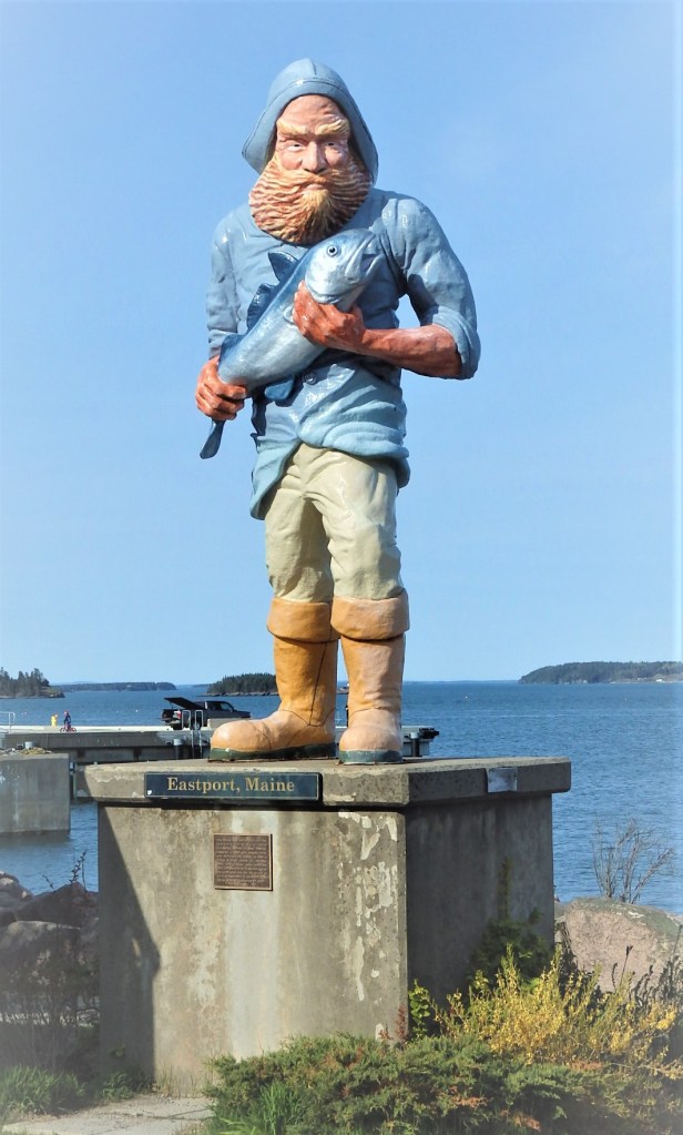
As far as I can tell, this fisherman has no name. He was left behind by the film crew of “Small Town X,” and he’s become Eastport’s waterfront emblem. The cod, meanwhile, looks petrified.
At a recent online writers’ conference, I was convinced to bite the bullet and release my novels at goliath Amazon in addition to the alternative ebook retailers where they’re already available. As I began pondering the new hurdles and strategies, I looked at Hometown News as a first offering.
A few years ago I had replaced the original cover, which sought to convey a sense of an idyllic small town where children could grow up safely, at least at the onset, with another of more urgency, reflecting the broader sense of the ultimately dystopian novel.
The new photographic image, though, was problematic.
The flames coming out of the residential window had the emotional message I wanted to convey, but they kept eating up the title and author credit, no matter which color I tried.
So I came up with this, trying to employ a trendy design element:
Returning to it now, though, I still felt an unease. The solution, in the end, was to make the artwork a bit smaller to give it more impact. Got that? It doesn’t make sense, but here’s how I’ve gone:
By the way, it’s now also available in paperback and Kindle at Amazon, as well as at Smashwords and affiliated ebook retailers.
We had to wonder the background of this building in Eastport, Maine. Could have been a factory, maybe fish processing, or a warehouse. Turns out to have once been the world’s biggest sardine cannery. The potential also intrigues, should anyone take up its restoration before it collapses into the tide.
As I’ve looked with delight at the renaissance of my small city’s downtown, one modeled in part on Jane Jacobs’ then revolutionary attack on urban renewal back in the ’50s, I am a bit bothered by how much of it is now based on a commercial cookie-cutter concept known as mid-rises – five-story stick-frame construction above a steel-frame pedestal that’s then given a brick or similar exterior facing.
It’s happening all over the country, actually, and not just in the heart of a city, either. Even here in Dover, we’re seeing something similar happening about a mile south of downtown as an over 50s-something neighborhood called Pointe Place with rents that astound me. Who can afford it? Some retirees, apparently. It’s a downtown within a doughnut, in effect. You can’t really walk there from anywhere else.
Of course, the Covid-19 pall casts a big shadow over these developments, but some observers say it might encourage more people to move from big cities to smaller communities like ours. We’ll have to be patient and see what actually unfolds.
As I’ve argued here in various forms, I’d rather have a real city center abutting organic neighborhoods, one with a funky fringe of mixed-use buildings, unlike apartment complexes surrounded by parking lots along the major highways or shopping strips.
What we definitely have here in Dover is the attraction of a river that rises and falls with the tide, as well as the historic mills once renowned for their calico and now serving as entrepreneurial incubators and housing.
Call it atmosphere and scale.
~*~
As Dover’s emerged as New Hampshire’s fastest growing city, the bulk of the new downtown residents are presumably singles and child-free couples, either young professionals or older folks who want the amenities of living close to restaurants, parks, and public events.
The retail and professional rentals are a larger concern, though, especially as many small merchants find themselves at a disadvantage against Amazon. Take the local hobby shop as an example. And that’s even before the bigger threat of coronavirus hit the entire economy.
Even so, these projects haven’t been on hold.
The new Orpheum takes shape downtown, matching the height of the old Masonic building to its east and the old Strafford Bank across from that. The spire at top left is city hall, a block away from the back of the new building in what was previously a parking lot.The Robbins Block storefronts are now gone and a five-story Orpheum is rising in their place. The hardware store, lower right, is still there. From the top left are the library, community center, and district court.
The old block may look charming in the photo, but the buildings were rundown and unwelcoming to pedestrians, as was the sprawling parking lot behind them. There was also a traffic bottleneck that’s being eliminated.
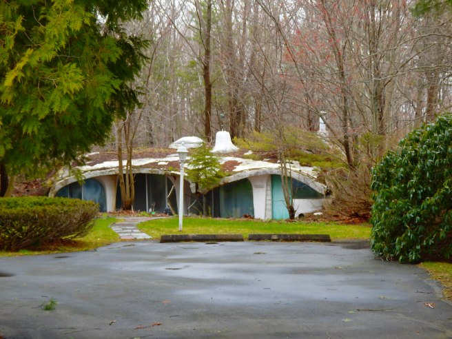
I must have passed this a thousand times before finally noticing it tucked in beside an older farmhouse. The return of foliage will soon have it completely hidden.