As we looked for ways to personalize our bedrooms, I quickly settled on white as the dominant paint color for mine. We had already agreed on keeping the downstairs walls white, on the creamy side, especially for the way it enhances the marvelous natural light we have here on the island.
In my case, I wanted the purest white possible, a reminder of the incredible beacon at the fringe of the moon immediately before and after a full solar eclipse. On a more practical note, the white theme guaranteed that the line between the ceiling and walls would be continuous rather than jagged.
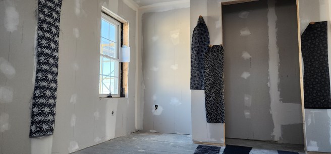
To close off the closet, I wanted a curtain rather than a door, in part to maximize space in the room and in part for a bold accent. I quickly gravitated toward indigo for the fabric. Yes, I have a taste for sushi and sashimi and Japanese design in general. The curtain inspiration, should you ask, springs from a few favorite restaurants. Besides, I have a long love of ascetic clarity, including the Shakers as well as Zen, even before I became Quaker and flirted with its historic Plain style, which can also be seen here.
The bedspread and bookshelves would add their own colors and textures to the mix.
~*~
Playing around with the blueness, I even did some online scans and duly noted:
My desired bedroom blue accent
Somewhere around 13 red, 27 green, 54 blue, 100% opacity
Just give me a name, somehow
Hex #0D1B36, for starters
As for the purest white of whites?
Is it even possible?
Just so I’d be ready when it came time to trot off to the paint store or fabric shop.
~*~
Christmas intervened before the upstairs was ready for painting.
Gift-giving in our family often turns into an art, sometimes including items found at yard sales. Other times it includes items you never knew you wanted or needed, though you soon discover otherwise – I’ve often been advanced on high-tech edges that way.
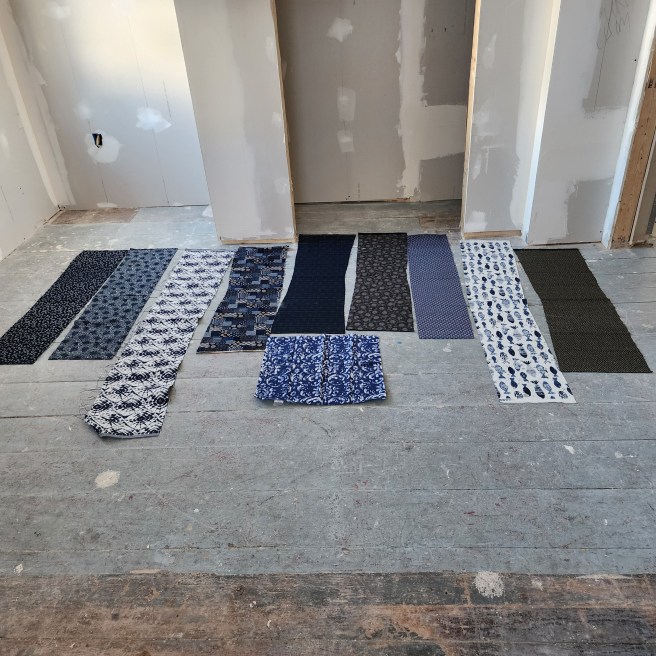
So, this past holiday, I unwrapped one box and encountered sample strips of cloth, all blue, nine in total, traditionally Japanese and dark blue. Along with an offer to make the curtain from my fabric of choice.
I had no idea it could get this complicated.
They were darker than the indigo I originally envisioned, as well as more intriguing. How would each one interact with the rest of the elements in the room? I invited reactions from others in the family, and weighed those in with my own observations. What caught my fancy early on soon moved toward more subtle patterns. I’ll leave it at that for now.
~*~
Beyond a café curtain on the double-hung sash window, I’m planning no “window treatments” in the room. (How I detest that term.) Privacy isn’t an issue, considering the height of the other windows, nor is direct sunlight in a north-facing room.
~*~
Continuing with the color choice palette and turning to the floor, online searches quickly convinced me that dark blue would be too much, even in small exposures. Dark red, which we had in Dover, would have resulted in a red-white-and-blue cliché. I started leaning on hunter green but began wondering if going lighter, as others in this project were thinking, might make sense.
However this turned out would be nothing like anything I had before.
