Fitting me like a glove

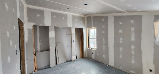
As I posted a year ago, this would be the first time I’ve had a tailor-made personal space. How heavenly! Look at those two windows higher up on the wall, allowing for shelving below and cross-circulation of air in the warmer months in addition to natural light.

Roughly 12-by-14 feet, including the closet and writing corner, much of it would be taken up with a very comfy double-sized bed, but the room was also intended to enclose my 200-plus journals, rows of LPs and CDs, a turntable and Bose stereo, hundreds of books, plus clothing, filing cabinets, and a writing corner. Hey, I’ve been downsizing.

The room is isolated, tucked away from everything, unlike the previous space where I could keep an eye on passers-by on the street and deliveries to the back door, the entry that got 98 percent of our use. I could even see the deer in our yard. The new room, in contrast, feels more like a treehouse, even with that double-sash window that displays a corner of the ocean and all of its changes.

~*~

My bedroom is the smallest of the four, but it fits me like the proverbial glove. If I sometimes think of it as being like a treehouse, that was something I never had as a kid, though I did climb often to the top of the elm in our back yard. I can nearly clamber to its tippy top in my sleep, almost 70 years later, hundreds of miles to the east.

In our renovations, the room is also envisioned as a place for my continuing downsizing, a consideration for my heirs who have no interest in my journals, manuscripts, recorded music, clothing, or ancestral snapshots and formal photographs. I don’t want to burden them with any of that. Still, despite my previous efforts, there’s so much I still need to sort through in my remaining time. Back to those journals, manuscripts, recordings, clothes, and photos. Some of that labor may even lead to future posts here.

Back when we moved into our Dover house, the one with the red barn in New Hampshire, I needed tons of space for my literary projects – everything was on paper. Not so now, especially after so much of that paper is now available to readers in digital publication.

What we did with the wall between mine and the front bedroom is especially delightful. Originally, the space was supposed to be divided between the two bedrooms, but then she who must be obeyed ceded it all to me, except for the space overhead. Her reason was that this was the wall where she decided her bed should go, and the bed would have obstructed the closet. OK, then.

Gee, I had been thinking about what might go up my side of the space. Instead, I have a bit of upper wall, which makes me wonder what might be displayed there instead. My Far West cow skull, perchance? Or a moose antler rack from around here?

My proudest part of my upstairs quarters is the writing center carved out of what would have been closet, up against an outside window. Here I can see a corner of the harbor and yet also have so much at hand overhead.

~*~

The back two bedrooms – mine and the one we’re designating as guest room – are largely square in their floorplan but were to have a signature charred beam running upward along the exterior wall, a reminder of the 1886 downtown fire that charred our rafters but didn’t get further than that. For us, these are also reminders of a chimney fire or two that the house also survived. For the most part, the rooms are mirror images of each other, except for differences in the wall that has the closets. More on that in a later post or two.

When it came time for the drywall to go up, we yielded on preserving that detail and instead went for an unbroken wall, mostly because of the expense of the labor needed to execute the details. Alas.

~*~

In the renovations, my room took priority because so much stuff from where we were dwelling downstairs had to move up to make room for ongoing work as it shifted to the first floor.

Besides, I was tiring of trying to sleep and write in the same chamber as the clothes washer and its noise. That future dining room was getting very crowded. We would need it as a staging area for the next stages of renovation.
Just to thicken the plot

As we looked for ways to personalize our bedrooms, I quickly settled on white as the dominant paint color for mine. We had already agreed on keeping the downstairs walls white, on the creamy side, especially for the way it enhances the marvelous natural light we have here on the island.

In my case, I wanted the purest white possible, a reminder of the incredible beacon at the fringe of the moon immediately before and after a full solar eclipse. On a more practical note, the white theme guaranteed that the line between the ceiling and walls would be continuous rather than jagged.

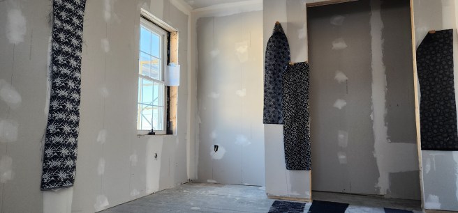
To close off the closet, I wanted a curtain rather than a door, in part to maximize space in the room and in part for a bold accent. I quickly gravitated toward indigo for the fabric. Yes, I have a taste for sushi and sashimi and Japanese design in general. The curtain inspiration, should you ask, springs from a few favorite restaurants. Besides, I have a long love of ascetic clarity, including the Shakers as well as Zen, even before I became Quaker and flirted with its historic Plain style, which can also be seen here.

The bedspread and bookshelves would add their own colors and textures to the mix.

~*~

Playing around with the blueness, I even did some online scans and duly noted:

My desired bedroom blue accent
Somewhere around 13 red, 27 green, 54 blue, 100% opacity
Just give me a name, somehow
Hex #0D1B36, for starters
As for the purest white of whites?
Is it even possible?

Just so I’d be ready when it came time to trot off to the paint store or fabric shop.

~*~

Christmas intervened before the upstairs was ready for painting.

Gift-giving in our family often turns into an art, sometimes including items found at yard sales. Other times it includes items you never knew you wanted or needed, though you soon discover otherwise – I’ve often been advanced on high-tech edges that way.

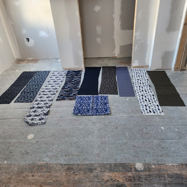
So, this past holiday, I unwrapped one box and encountered sample strips of cloth, all blue, nine in total, traditionally Japanese and dark blue. Along with an offer to make the curtain from my fabric of choice.

Just to see how they might work in the room.

I had no idea it could get this complicated.

They were darker than the indigo I originally envisioned, as well as more intriguing. How would each one interact with the rest of the elements in the room? I invited reactions from others in the family, and weighed those in with my own observations. What caught my fancy early on soon moved toward more subtle patterns. I’ll leave it at that for now.

The full array plus a batik dinner napkin that had started my thinking.

~*~

Beyond a café curtain on the double-hung sash window, I’m planning no “window treatments” in the room. (How I detest that term.) Privacy isn’t an issue, considering the height of the other windows, nor is direct sunlight in a north-facing room.

~*~

Continuing with the color choice palette and turning to the floor, online searches quickly convinced me that dark blue would be too much, even in small exposures. Dark red, which we had in Dover, would have resulted in a red-white-and-blue cliché. I started leaning on hunter green but began wondering if going lighter, as others in this project were thinking, might make sense.

However this turned out would be nothing like anything I had before.

Ten things Baskerville, so do come along

As I’ve related in other posts here, ours is widely known around town as the Anna M. Baskerville house.

For a writer and editor like me, though, Baskerville was also an important typeface in the advancement of printing.

It was the body type of the first newspaper I edited, the Belmont Hilltopper. Yup, back in high school. Our headlines were mostly Bodoni, another classic that’s mostly vanished in the internet era.

Here’s an introduction to its founder and a bit more.

So here goes for this week’s dive into arcane wonders.

  1. The typeface was designed in the mid-1750s by John Baskerville in Birmingham, England, as an intermediary between older styles, including one of my favorites by William Caslon.
  2. Baskerville increased the contrast between thick and thin strokes, making the serif faces sharper and more tapered, and shifted the axis of rounded letters to a more vertical position. Maybe you take that for granted, but it does enhance readability. Trust me.
  3. He was a wealthy industrialist who started his career as a teacher of calligraphy and a carver of gravestones before making a fortune as a manufacturer of varnished lacquer goods. You never know where you’ll encounter a true inventor or artist.
  4. In 1758, he was appointed University Printer to the Cambridge University Press, where in 1763 he published his master work, a folio-size Bible. Glory be!
  5. On his death his widow Sarah eventually sold his material to a Paris literary society, placing them out of reach of British printing, not that the move stopped imitations. The French, on the other hand, seem to have loved his openings.
  6. Oh, my, the technical discussions lead to a true rabbit hole of fine distinctions. I’m not going there, though some of you readers definitely should.
  7. John Baskerville is also noted for inventing a wove paper, smoother than laid paper that allowed for better printing impressions. One advance can definitely lead to another.
  8. Even as an avowed atheist, he was appointed printer to the University of Cambridge where he printed The Book of Common Prayer in in 1762 and a splendid Bible in 1763.
  9. By the way, you won’t find a town named Baskerville on a map. There is, though, a Baskerville Hall in Wales.
  10. A more likely place to find Baskerville is in the novel by Arthur Conan Doyle, one of the most popular novels ever.

Plenty of space for hanging clothes, by New England standards

A traditional New England home comes without closets, or perhaps has some quirky ones that were added later but inefficiently. It’s an unanticipated jolt for those of us who grew up elsewhere.

That tradition was something our renovation sought to rectify. Indeed, maximizing storage space was a pivotal consideration in our planning. As I’ve noted, our present home is smaller than the previous one, not that its closets were notable, even before considering all the storage capacity we had in the red barn. Yes, the barn that inspired this blog. The garden shed we added here is much, much smaller.

A few locals have been surprised by the results – what they see as closets everywhere in the newly redesigned upstairs. Each bedroom has one. Although these are shallower than a full-sized walk-in closet, they are deep enough for hanging clothes, which is our primary need.

The key in adding these came in realizing that the distance between the gable windows was two feet, enough to run narrow closets along the dividing line between the front and back bedrooms. Our original plan had those closets alternating, half for one bedroom and the other half for its neighbor. But that changed when we decided to give all of that opening to the back bedrooms, which were also smaller.

In compensation, the two front bedrooms got a shallow loft running atop those closets, as well as their own closets elsewhere in the reconfigured rooms.

Quite simply, the closet in each bedroom is unique.

Guest room closet will have three doors.

Additional storage space appears in the laundry room as well as a small hallway broom closet. Yes, even a place to stash the vacuum cleaner.

How many types of boats under sail do you recognize?

Living around big waters, as I do now, means hearing a number of new terms to identify boats big and small. When you merely read about them, say in a history book, you can usually skim over the word and move on.

Not so when you’re trying to describe what you just saw.

Today we won’t attempt to get into the array of mostly motorized vessels. Not even a Bayliner versus a Boston Whaler. Naval ships alone would require a long list.

Instead, let’s look at a general overview of boats originally powered by the wind. (Admittedly, today many of them will have an internal engine for additional power.) These can range from small sailboats to majestic tall ships.

  1. Sloop. The most common type of sailing vessel, it has a single mast, usually with one triangular mainsail (in what’s called Bermuda rigging) and, in the front, a triangular headsail, usually a jib. These can range from small, single-person fun boats to larger racing boats manned by trained crews.
  2. Cat. Or catboat. Has a single mast rising from the front of the boat and a large, single sail on a long boom. A second beam of wood, called a gaff, runs along the top of the sail, turning it into a four-sided sheet of hexagonal shape rather than the triangle. They were popular New England workboats around the early 1900s, short (typically ) 20 to 30 feet long and wide, highly stable, and have made a comeback today.
  3. Cutter. A single-masted vessel resembling a sloop, but often having a gaff-rigged mainsail and an extended spar called a long bowsprit extending from the bow, which allows a second headsail (a staysail, or “staysul.”)
  4. Schooner. Two or more masts, with the largest sail (the mainsail) at the aft, plus a foresail (resembling the mainsail) on the mast ahead of it as well as a jib and staysail at the bowsprit. They may also have one or more topsails and a small sail called a mizzen aft of the mainsail. With their complex rigging, they can be fast and undeniably majestic. And, yes, my favorite.
  5. Ketch. Resembles a schooner but has an extra mast behind the mainsail.
  6. Yawl. This term has several different meanings, the first regarding rigs with one or two fully equipped masts plus a mizzen mast aft. It can also refer to a double-ended hull boat that could be worked from the beaches, not that I’m finding any reference to sailing in what would be the equivalent of reverse gear. Some of them, if you’re a bettor, may have been the fastest-sailing open boats ever built. And it even seems to be a kind of dinghy. Just so you get an idea of how loose some of these terms can be.
  7. Brig. This two-masted ship introduces us to square-rigging with sails arrayed on horizontal spars perpendicular to the keel and masts – that is, “squared.” The spars, called yards, present the sails to face the wind from behind. The foremast of a brig is always square-rigged, but some varieties may have a gaff or lateen sail on the mainmast. (Lateen is an ancient arrangement I won’t get into unless you’re going to Egypt.) “Square,” as far as masts go, means more or less perpendicular to the hull, unlike the ones more or less parallel to the hull. Trust me on this.
  8. Barquentine. Its foremast was square-rigged, with gaff-rigged masts behind. But let’s skip ahead.
  9. Barque (or bark). A three- to five-masted square-rigged ship consisting of a foremast, mainmast, and a smaller, often gaff-rigged mizzen mast at the aft for steering stability. Far and away the most numerous of the square-rigged vessels. Enough of the finer points. Let’s turn to the most glorious.
  10. Tall (or full-rigged) ship. Three or more masts, all fully square-rigged, one sail above another, often five or six on a mast, with a hull often much longer than a schooner. The individual sails were smaller than a schooner’s and less likely to rip out in a storm, but the number of them provided more overall sail surface, allowing for maximum speed. The downside was that crews of 30 or more sailors were required for handling those sheets. Still, seeing one of them is exciting. It’s what you really picture first, after all. Now, for all of the subcategories, such as a frigate.

Underfoot counts, too

Another consideration I haven’t mentioned was the upstairs flooring.

As much as we would have liked polished hardwood, our budget called for something more affordable.

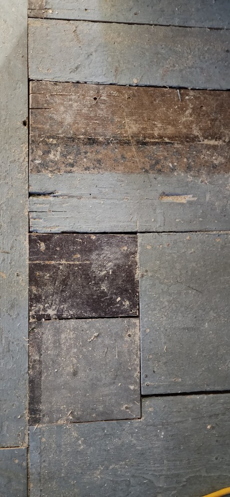
The existing flooring was more piecemeal, with unevenness and knots. It did speak of the rustic origins of the house and its historic character. Our contractor mentioned some flooring that would match it, and we were onboard. (Sorry for the pun.)

Refinishing those planks might have looked historically charming, though they were never great to begin with. Instead, we salvaged what we could and added fresh to continue.

The next question was how to treat it. Apart from two rooms and a hallway of vinyl flooring downstairs, the existing flooring, upstairs and down, had been painted a light blue that easily flaked. Could it be sanded and refinished in a natural finish? Did we have time to undertake that? Otherwise, what color of paint could we agree on, at least for the bedrooms? The bathroom and laundry room might be a different matter requiring something more waterproof.

I had hoped to decide on a paint color extending across all of the upstairs. Mine was the minority vote.

That left me facing a decision for my room. Please stay tuned.

Surprise at the top of the stairs

People looked skeptical when they heard that we were living in the house during all of the renovation.

It’s not like our budget had enough of an edge for us to lease quarters elsewhere. Were we just more daring or more tolerant than others?

A key to the project turned out to be the translucent plastic “door” created at the top of the stairwell at the beginning of the work, the one with the zipper. It reduced the amount of dust that escaped from the construction and also kept much of our heat down on the first floor.

The sound of that zipper became a fact of life for us. All three zippers we had over the course of the project.

~*~

What awaited us on the other side of that veil went through a progression.

At first it faced a crowded set of shelves set in under the sloping roof, along with sliding doors to two makeshift closets and a narrow hallway running to each side.

After that came the demolition that revealed charred rafters and sheathing.

We briefly had a stretch of open sky followed by the raised roof and then the framing for the bathroom and laundry room.

What caught us by surprise, though, was the blank wall when the sheetrock went up. The stairs didn’t lead straight to another door. What would we put there? A large painting? A bookcase? A settee?

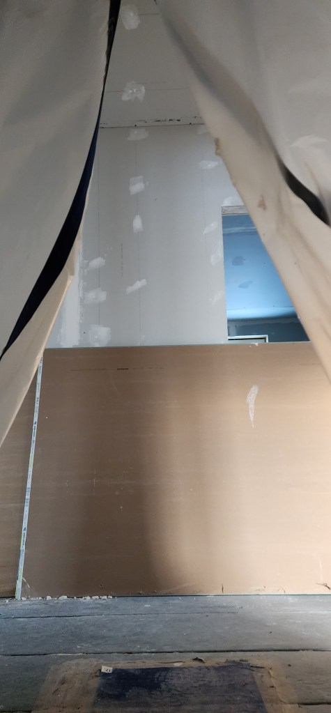
With the zippered curtain pulled back, you can see the wall and a corner of the laundry room door. Drywall panels are stacked upright against them.

One of the coconspirators in our planning insisted on having a wide hallway, or perhaps more accurately, a landing – 6-by-16 feet, it turns out – conjoining the doors for the four bedrooms, the bathroom, and the laundry room. As a practical matter, this would make moving large items much easier, but aesthetically, the space feels wonderful, especially when we decided to keep the ceiling there running all the way to the crown of the house rather than having a low flat one.

No photo would get you a sense of that.

~*~

Somehow, Adam managed to keep the stairwell in place through all of the demolition and rebuilding. It did have that hand-cut oak lathing that predated 1830, for one thing, and the period molding.

For months, it stood like a dark ark at the center of all the action.

Once the new upstairs walls and details were in place, he turned to repairing the stressed stairwell walls and ceiling. One alteration we had envisioned was an interior window for natural light from the bedroom nook. Minor touch, but satisfying. Alas, one that was cut, in part for budget considerations.

We also gained storage space above in a kind of mini-attic accessed from a bedroom. It’s perfect for seasonal decorations that are needed just once a year. Easter, Halloween, Christmas, mostly.

~*~

As I had to confess by this point, the project was much more complicated than I had expected. I could now see why one contractor had just wanted to gut everything from the get-go, while another wanted to rip the top off and replace it with a gambrel roof. But I’m confident neither of those routes would have led to what’s emerged.

I was tempted to call them ‘staterooms’

A full Cape is a classic American design with some good traffic flow downstairs, but it has drawbacks on the second floor, where rooms can feel cramped by low ceilings and be too hot in summer and too cold in winter. Our house was no exception, something we hope we’ve rectified.

In maxing the ceiling heights by following the new roofline, we gained both headroom and air circulation. That move also adds character to each of the resulting rooms, making them something more than rectangular boxes with holes punched in them for windows and doors. (See the ongoing argument in previous posts.)

The sprayed insulation also enhances year-‘round comfort by reducing radiant summer sun impact as well as invasive winter cold.

In addition, the setting of the windows in all four bedrooms provides cross-ventilation, as needed, and the casement windows in the two smaller rooms reduces any draft entry. Each bedroom has windows on two walls, not just one.

We’re especially happy with the resulting four bedrooms, what I was tempted to call “staterooms,” as they are on a ship. There, the chambers follow the contours of the hull and deck overhead, and ours do something similar.

The front two also have a commanding view of Friar Roads, the channel between us and Campobello Island, Canada, while another looks out on a street of a distinctly New England fishing village nature. The fourth looks into trees and the village, giving it a sense of being a treehouse. Rather heavenly, as I’m finding.

For now, I’ll turn your attention to the front two, which overlook Eastport’s principal north-south street, not that it has heavy traffic. Remember, our fair city doesn’t even have a stoplight. Not one.

The front two bedrooms have the quirk of a panel that follows the original roofline before the dustpan dormer kicks in. This results in a small cubby space that creates a small storage cabinet in one bedroom but is left free to run to the floor in the second.

The main differences between the two bedrooms springs from working around the existing stairwell. Our historic stairwell, definitely pre-1830, from the hand-cut oak lathing.

If you divide those two rooms apart by drawing a line halfway between the north and south exterior walls, you’d see that the north bedroom would have been smaller than the south room because it had to accommodate the stairwell. What it gained in the renovation, though, was a charming nook between the stairwell and the outside wall. The space between the stairwell and wall had been a mystery, a wasted space where we  thought we might find any buried skeletons in the house. Alas, only dust and spiders.

The nook, as we discovered, had to stretch a bit beyond that halfway line north-south, because the room’s window was centered there (above the front entry door). Our solution was to have that extension be matched by a closet running along the stairwell in the south bedroom.

The nook does make for a nice, slightly secluded study with that stunning view, especially around dawn and sunset.

Let me remind you that all of that distance to the exterior wall was space added during the renovation.

~*~

As we approached the time for priming and painting the upstairs, we had to admit we had more than 3,000 square feet of drywall to cover with primer and paint, even before considering the flooring. More decisions! As well as delays. 

There, I settled on a brilliant white for my walls and ceiling and what Sherwin-Williams called Smoky Blue for the floor.  

~*~

The cathedral ceilings not only enhanced our celebration of the natural light in our house, they also gave us something we didn’t anticipate: loud rain on the now metal roof, something we usually find comforting, so far. Not that everyone would.

But these rooms are also free of any rolling you’d endure on a ship.

Everybody’s mostly happy with the resulting twists. Remember, nothing in life is perfect, no matter how hard we try. 

Back to the press and a personal debt

The first printing press in Britain was established at Westminster in 1476 (during the reign of Edward IV, 1461-1483) by William Caxton. Modern movable type had been invented not that much earlier around 1450 by Johannes Guttenberg.

Caxton is considered a central figure in establishing Chancery English to the standard dialect used throughout England. In his haste to make translations for publication, he imported many French words into English.

Well, England did rule much of France during the century.

As a reader and writer, I’m indebted to both men and a host of those who followed.

Lately, I’ve been returning to the Baskerville typeface, which we used for our high school newspaper, though now its in honor of an earlier resident of our house. The face dates from the 1750s.

One classic I’ve long been fond of is Caslon, from the 1720s, by another English designer. It’s similar to Goudy, a 1915 American design based on historic Italian faces and one I’ve been using on my Thistle Finch publications. It really is elegant.

Sometimes the very appearance of a word in type or a well-designed page will make my heart sing.

Just so you know what happens when ink gets in your blood.