KEEPING THE COMPANY IN CHECK

Across New England, the spire on city hall typically had prominent clock. Its purpose, I’m told, wasn’t just civic pride.

No, it was to keep the mill owners in check, just in case they were tinkering with their own clocks to squeeze unpaid time out of their workers.

It’s comforting to know the town fathers could stand up to corporate powers. Most of the owners, by the way, lived far from these sources of their wealth. Many of them were Boston Brahmins clustered around Harvard.

In honor of the workers and those who stand up for them, Happy Labor Day.

ALWAYS ROOM FOR IMPROVEMENT

Earlier this year, I updated the cover and tweaked the contents of my novel Hometown News.

I liked the new image, of a house on fire rather than one of a girl in autumn leaves. The story is, after all, about a community in crisis rather than the delights of living in idyllic repose.

The new image, however, challenged the use of placing the book title and author. The colors jump all over the place, and I just couldn’t figure out a way to drop the words in effectively. Well, you can see what I did. Still, I felt ambivalent about the results.

And then, a few weeks ago, I was looking at my revised lineup at Smashwords and sensed this one just didn’t quite match the style or tone of the others. Time for a few tweaks.

So here’s what we have now:

Hometown News

After this:

Hometown News

Which replaced this one:

Hometown News

The covers of my Smashwords editions originally paid homage to Richard Brautigan’s classic books of the ’60s, each of which had a portrait of a pretty young woman.

Any reactions?

SOMETHING MORE COMPELLING

Looking at my new lineup at Smashwords, I felt one cover just didn’t match.

The first round of my editions there had covers that were an homage to Richard Brautigan’s classic books of the ’60s, each of which had a portrait of a pretty young woman.

As I looked at the cover image, though, it felt dated. Looking closer, I realized it also didn’t reflect the edginess of the contents. I wanted something more compelling than a woman in quiet reflection.

So here’s what we have now:

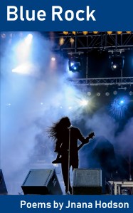
Blue Rock

Rather than this:

Blue Rock

Whaddya think? For more, go to Blue Rock.

TWO TWEAKS IN THE DESIGN

As I moved from the Advance Reading Copy to the First Edition of my new novel, I decided to make two tweaks in the cover design.

The photo itself remains unchanged. It’s the typeface that altered.

When I lined the original cover up beside the covers for the related books in the cycle of Cassia’s discoveries, I realized it’s serif typeface was out of step with the sans serif on the other three volumes. As much as I love serifs (they have more character, for one thing), I also saw that a sans would have more punch on the thumbnail size used to display most ebooks. OK, so that changed.

Again, as I considered the four books together, I saw something else happening. The next book in line, Daffodil Uprising, features a prominent daffodil bloom in a bright yellow antique-style drawing. The contrast between its artwork and the photo on What’s Left works, I think, but the white title somehow felt out of step.

That’s when the thought flashed, “You idiot! It has to be yellow! Like the yolk! Like the daffodil, too!”

Here’s the progression. First, the ARC:

What’s Left

Then the sans serif:

And finally color:

What’s Left

So here you have it. Any reactions?


THE TOWER VIEW

A large Queen Anne-style house with a distinctive witch’s hat tower something like this is the headquarters for Cassia’s extended family in my new novel, What’s Left. If only this one were pink, like hers.

As I viewed photographs of the kind of Victorian house her family would gravitate toward, having a round tower at one corner seemed natural – especially one capped by a pointy roof commonly called a witch’s hat. The idea of living in a tall-ceilinged attic, with its air of private retreat, holds romantic appeal anyway, but having it open out into a circle room with views overlooking the street in both directions strikes me as a plus. How about you?

Continue reading “THE TOWER VIEW” →

AND NOW, FOR A COVER!

Thanks to everyone who responded to my earlier invitation for comments regarding a few possible covers for my newest novel.

The survey ended in mixed results and prompted some heated in-house discussion, ultimately sending me back to the drawing board for a more compelling design.

Just what do we want as a cover, anyway? Are people’s faces a help or a distraction? Does a jacket work best if it somehow reflects a scene in the story, as my earlier mock-ups attempted to suggest? Or is reaching for a less constrained, emotional reaction more effective?

What’s Left

As you see, I’ve opted for the later. Here the image invokes a sense of being broken out from a protected shell and falling through space. It’s also appropriate for a family that owns a restaurant – food being a theme running throughout the story. Will this cover encourage a browser to open the book to discover, in effect, just what happens to the yolk? Where it will land?

That, of course, is my goal. To see if it fits, go to Smashwords, where you can order your own Advance Reading Copy for free. The offer will expire after 90 days, when the first edition comes out at $4.95, so act now.

Your early reactions will be most welcome in preparing for that release.

PRELUDE & FUGUE 28/

an elephant with flowers painted
around the eyes and painted toenails

four zebras sipping water

*   *   *

luxurious green tent on safari white bone
ornaments through noses armed for the hunt
and cocktails already served
three African bushmen in a field of wrinkled flesh
eyelid (the elephant) the rain
is needed, sticky or no sticky (unlike the rhino)

zebras, black and white in a splash of vibrant green
with netting over the bed
luxurious green tent on safari white
bone ornaments through their noses
armed for the hunt and cocktails
already served three bushmen in a field
of wrinkled African flesh, an eyelid (the elephant)
the rain is needed, sticky or no sticky
(unlike the rhino) zebras, black and white

in a splash of vibrant green            with netting
over the bed’s luxurious green safari tent
white bone noses armed for the ornamental
hunt cocktails served by three bushmen
in an African field of wrinkled eyelids needing rain
sticky or no sticky the elephant (unlike the rhino) or
zebras, black and white in a splash
of vibrant green netting over the bed ornaments

beasts leaping from dust into a tropical river
before a tiger atop a car spirals between
four zebras sipping water the way
a camel’s nose runs ahead of its mouth:

the hairy trunk and mouth of an elephant, so spotted
forages on hind legs, trunk and tusks upraised to the tree

the elephant with flowers painted
around the eyes and painted toenails
still leaps from the dust into a tropical river

a camel’s nose runs ahead of its mouth from hind legs
upraised to the tree in front of the tiger
atop a car of spiraling spots

the hairy trunk and mouth with flowers painted
around the eyes guarding four zebras sipping water
and the foraging beasts leap from dust into the river
running ahead of its mouth

a camel on hind legs, the tree painted with flowers
and toenails a feeling of life finally coming together

atop a car, four zebras leap from the dust
into a hairy river and forage
a feeling of life finally coming together these days

~*~

Poem copyright 2016 by Jnana Hodson
To see all 50 Preludes & Fugues, click here.

ESPRESSO FIT FOR THE GODS

With a holiday touch.

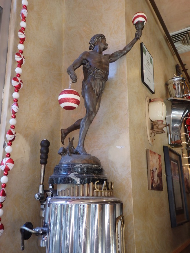
Vittorio’s in the North End is famed for its espresso and pastries. With Mercury as one of the coffee makers, you can see why the neighborhood is also renowned as Little Italy.

Boston is a rich and varied destination – the Hub of New England, or the Universe, as they used to say. Living a little more than an hour to the north, we’re well within its orb.

CURTAINS

to embrace something with the wisdom of the final round

people crowding the boulevard in Baltimore
to watch Robert Kennedy’s funeral train pass
overhead

in that portrait of seven famed figures
Annie, turned to stone under a blue-jay feather

how that small town in snow looks more like Pennsylvania
or Midwest
than New England

Blake, the Muggletonian and lithographer
the surviving Beats portrayed
as Ginsberg tying a shoelace

would see something with the sharpness of the first time

all that baroque light over a cathedral altar
the cumulus effect
enveloping a solo deer

naked
in the garden
awaiting snowfall

Poem copyright 2016 by Jnana Hodson
To see the full set of
Partitas, click here.

PRELUDE & FUGUE 48/

with fiddles and crows
tracing a map of yellow leaves

*   *   *

on a map of frosted snow
three crows with their fiddles
in the crown of their living

of a rock face map, frosted snow
three crows with their fiddles
in the crown of their living rock face

on a map, frosted snow, three crows
with their fiddles in the crown
out of their rock face, tracing some life

 atop scree, another one at the bottom, wintergreen

~*~

Poem copyright 2016 by Jnana Hodson
To see all 50 Preludes & Fugues, click here.